Penman for Monday, May 26, 2014
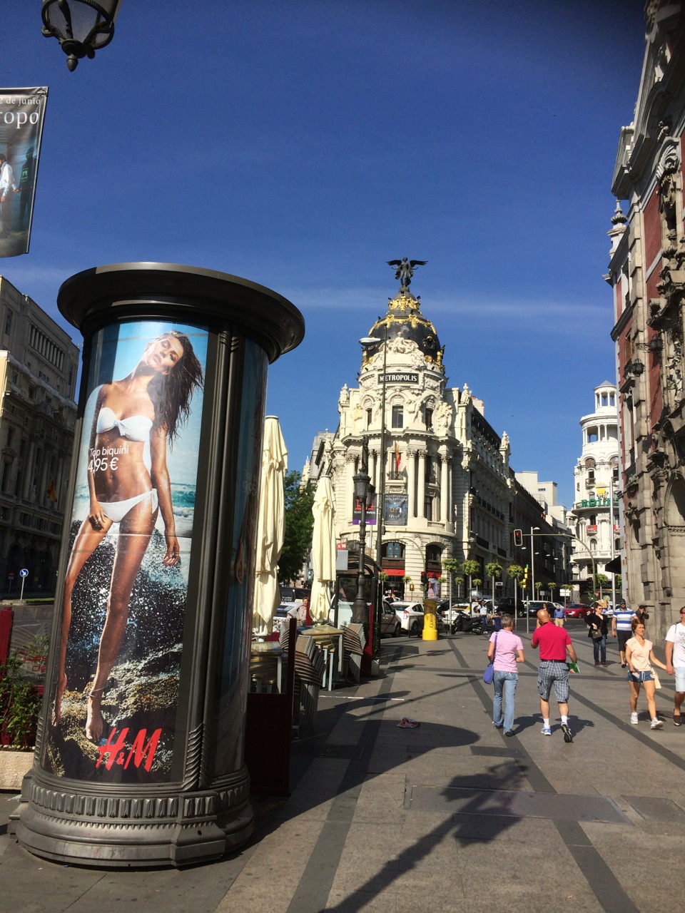
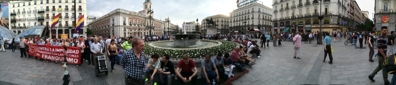
MAYTIME IN Europe, particularly in Spain, is a festive season; Madrid has the same patron saint and feast day as many Philippine towns such as Lucban—San Isidro Labrador, on May 15—and so it was a fine time to be there these past two weeks. We missed the actual feast days, and in France all the buzz was going on in Cannes while we were in Paris, but it was just as well because the crowds were a bit smaller but the experiences no less interesting at the periphery.
As I mentioned last week, doing six cities—Madrid, San Sebastian, Barcelona, Venice, Florence, and Paris—in 12 days is murder for sexagenarians, and maybe not the best way to get to know places, but the intensity of this “amazing race” approach has its own advantages and surprises.
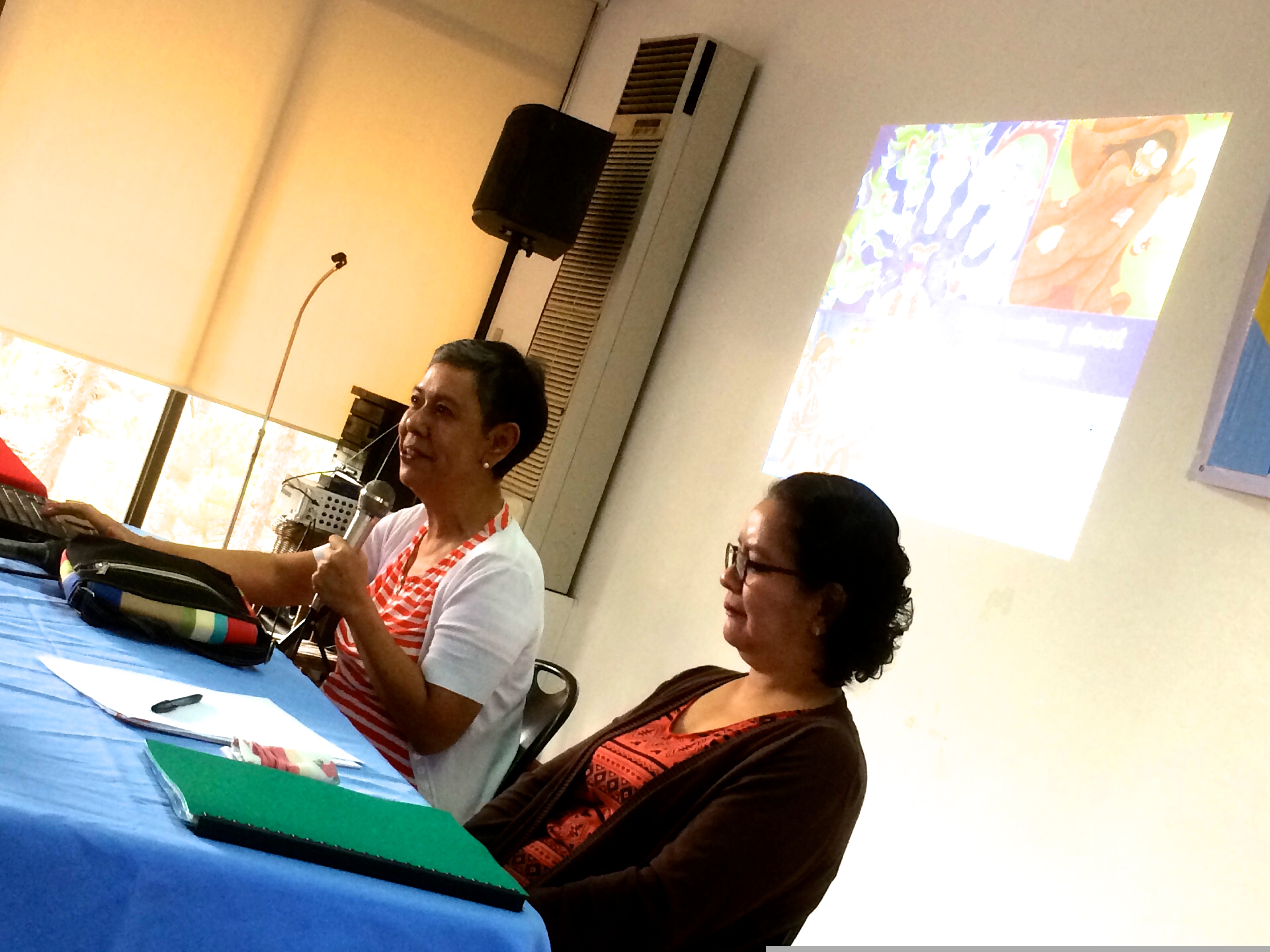
I’m usually an obsessive planner when it comes to travel, going digital as much as I can, months in advance—from consulting TripAdvisor to making plane and hotel bookings to reconnoitering possible spots to visit and downloading street maps, subway guides, and travel apps. (I’ll do a separate piece on this madness, one of these days.) This time, aside from some basic planning, we left many things to chance, going by such general interests as “museums and flea markets” or “art galleries and food” to guide us though a city. Serendipity (informed, to some extent, by a limited budget) proved to be the best tour guide, as we allowed one street to lead to the next, and open up to unexpected delights.
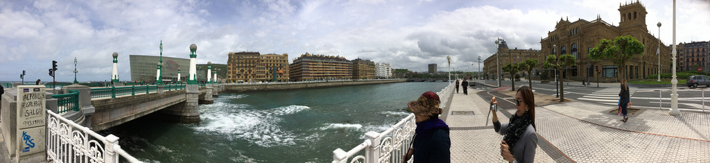
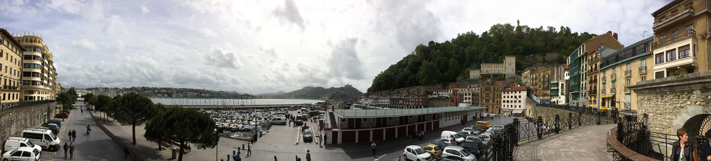
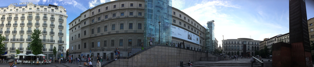
San Sebastian, or Donastia in Basque, was the wild card on our itinerary. The place doesn’t figure in most visitors’ travel plans, and frankly, as global-savvy as I pretend to be, I had to look it up on a Spanish map when our daughter Demi and her husband Jerry mentioned it to me. The two had met Anthony Bourdain at an event in California, and had asked him where in the whole world he would retire if he had his choice, and Bourdain didn’t take two seconds to answer “San Sebastian,” obviously because of the food.
That answer stuck with Demi and Jerry, and when the four of us started planning our European sojourn early this year—we made all our bookings in mid-January—San Sebastian was firmly on the list, although we knew very little about it. For me, the appeal was that it was up in Basque country, on the coast of the Bay of Biscay close to the French border, so it promised an atmosphere different from central Madrid, or Barcelona in the Balearic-Mediterranean south. I also relished the thought of taking the five-hour train ride cross-country; train travel is one of Europe’s most relaxing treats.
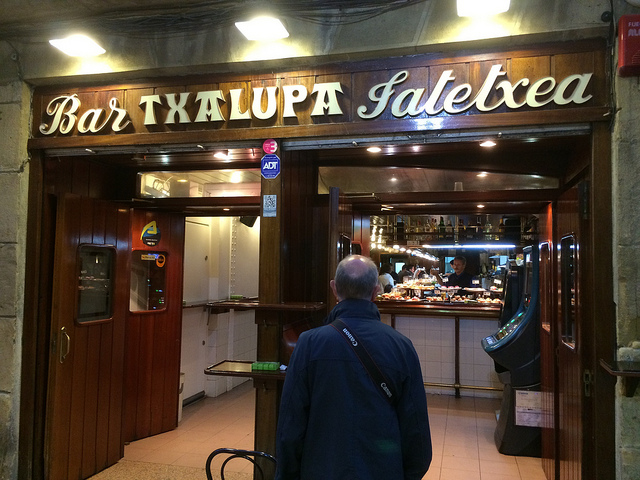
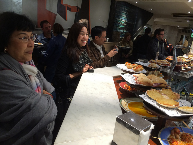
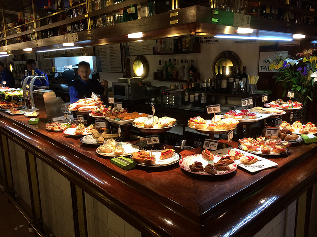
The Basque language, I’m sure, has its poetic charms, but to the untrained eye and ear (like mine) it might as well be Klingon, with a surfeit of X’s, K’s, and T’s. Many words have absolutely no relation to their Spanish or Latin counterparts; a restaurante in Spain or a ristorante in Italy is a jatetxea in Basque.
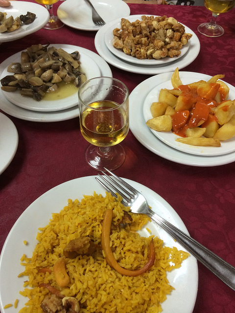
That said, food is a universal language, and while I’ve maintained a stubborn and silly pride in calling myself a culinary philistine (as usual, I brought six packets of ramen in my suitcase), I had to yield to the majesty of Basque cuisine, particularly their pintxos—the local version of the more familiar tapas. Laid out on the bar of every jatetxea we entered, and selling for a little over a euro each, the pintxos were scrumptious combinations of such staples as shrimp, crab, mushroom, asparagus, anchovy, jamon serrano, and bread.
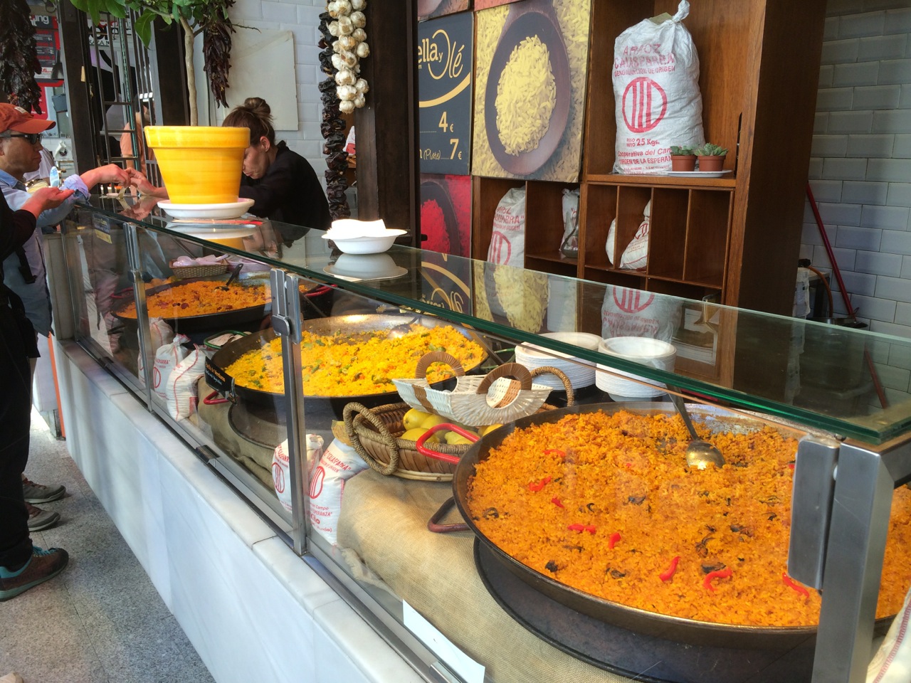
Good, affordable food would be our constant on this tour, often found in rather unlikely places (no Michelin guide for us, just our budgets and our noses): the best pasta we’d ever had, in a nondescript restaurant in Florence; a roast chicken, rice, and salad dish at the Doner Kebab place beside our airport hotel in Madrid; a dish of stewed mushrooms in Madrid and then also in Barcelona.
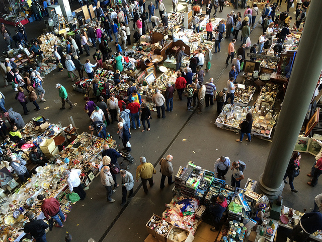
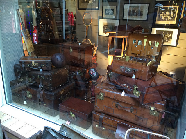
Our next high came from shopping—albeit more with our eyes than our wallets. Beng and I are incorrigible flea and weekend market addicts, and we’ve been to a few of the world’s better-known ones, from Hell’s Kitchen in Manhattan and Portobello Road in London to Chatuchak in Bangkok and Panjiayuan in Beijing. Providentially, our European schedule coincided with the Mercat del Encants in Barcelona and the Marche aux Puces de Saint-Ouen at Clignancourt in Paris. Hundreds of stalls and tons of glorious junk met us in both places, from century-old magazines and posters to ‘20s flapper dresses and hats and erotic postcards of nubile maidens long vanished.
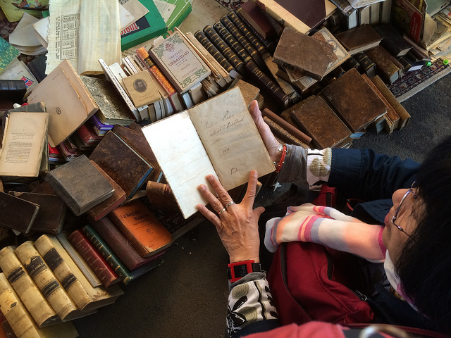
I did find quite a few fine fountain pens—only to realize, alas, or perhaps fortunately, that I should be happy with my present collection, and that looking without buying can be pleasure enough. I came home from Europe with a new panama hat from Madrid (where, I would find, it was quite the fashion) and a 4-euro, 1960s bottle of Pelikan ink in royal blue, still almost full and certainly usable, from Barcelona. Beng and I kept looking at marvelous pieces of décor and sighing, “If we had a larger house…” or “If we were younger….” and then taking a picture for the memory before walking away.
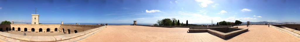
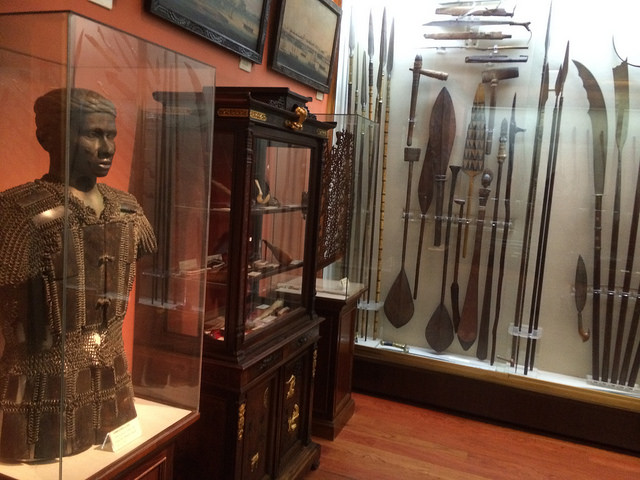
Third, next to food and markets, were the sights themselves. With limited time, we focused on museums, landmarks, and gardens. Everyone goes to Barcelona to see Gaudi’s outrageously magnificent Sagrada Familia, and we did, if only from the outside, from where there was more than enough to appreciate, from the strawberries to the scripted verses climbing up the spires. What resonated more deeply with me was a visit to the Castell de Montjuic, an imposing fortress with a tragic past, including the brief incarceration of Jose Rizal in 1896, shortly before his forcible return to the Philippines; an exhibition room in the fortress is named after Rizal.
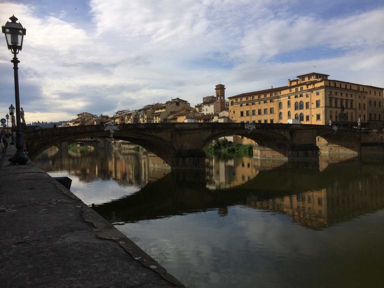
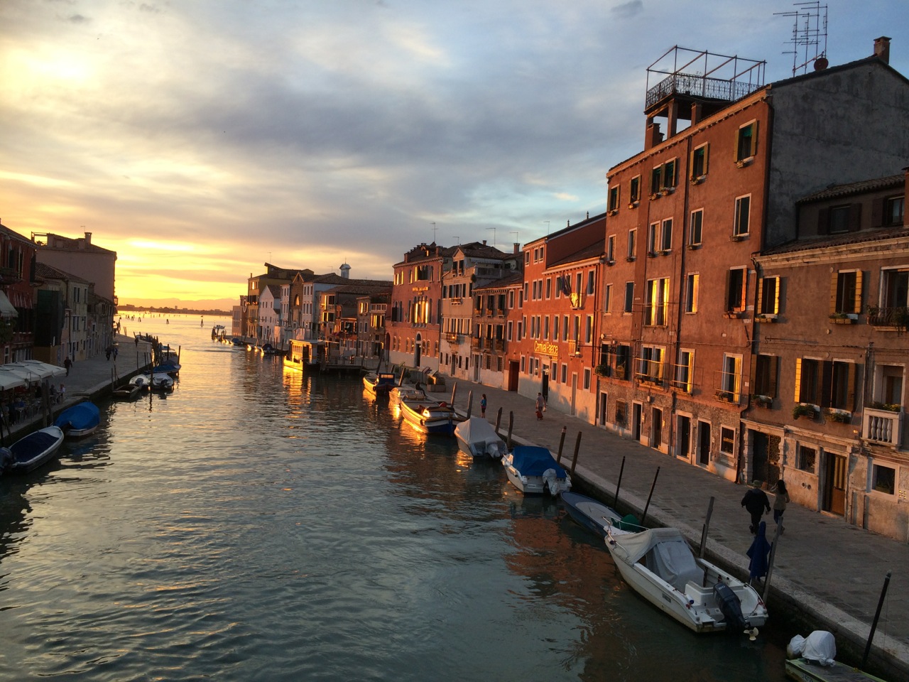
 Venice and Florence were the original reasons we thought of this tour; having visited them three years ago, I vowed to bring Beng along to see them, and we just had time for a long vaporetto ride around Venice in the gathering dusk and a day trip by train to Florence. Both cities offer a surfeit of majestic sights, but again it was less the landmark everybody knows than the accidental detour to a spectacular sunset from a little bridge and a view of steeples in the Tuscan countryside that mattered more.
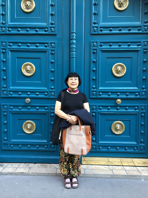
Beng and I had been to Paris twice before, for very brief sorties like this one. In 1999 we almost literally breezed through Paris on a bus from England, on a 99-pound all-in weekend tour; Beng made the mistake of going to the onboard loo while we whipped past Rodin’s “The Thinker.” In 2002 we spent another couple of days in Paris on our way home from my month-long fellowship in Bellagio, and I was so starved for Chinese food that we ate nothing but Chinese, in the restaurants behind the Galeries Lafayette (we went back there last Sunday for a reprise, but the place was closed, much to our dismay).
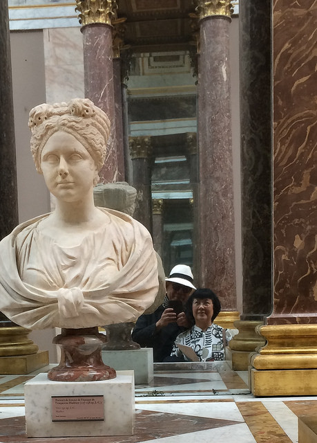
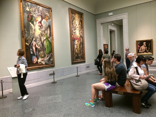
We revisited the Louvre, and of course again the Mona Lisa (this time set a little farther back from the public than it used to be, but still accessible enough for the inevitable selfie). The Louvre draws 15,000 visitors a day, most of them, like us, paying the standard admission of 12 euros—a cost you’ll quickly forget the minute you step into the galleries. This time I happily stumbled into a hallway exhibiting three of the most iconic of French paintings: Delacroix’s Liberty Leading the People, Gericault’s The Raft of the Medusa, and David’s The Coronation of Napoleon. Somewhere in the Egyptian antiquities section, my knees began to wobble, and I knew it was time to declare an end to our museum-hopping.
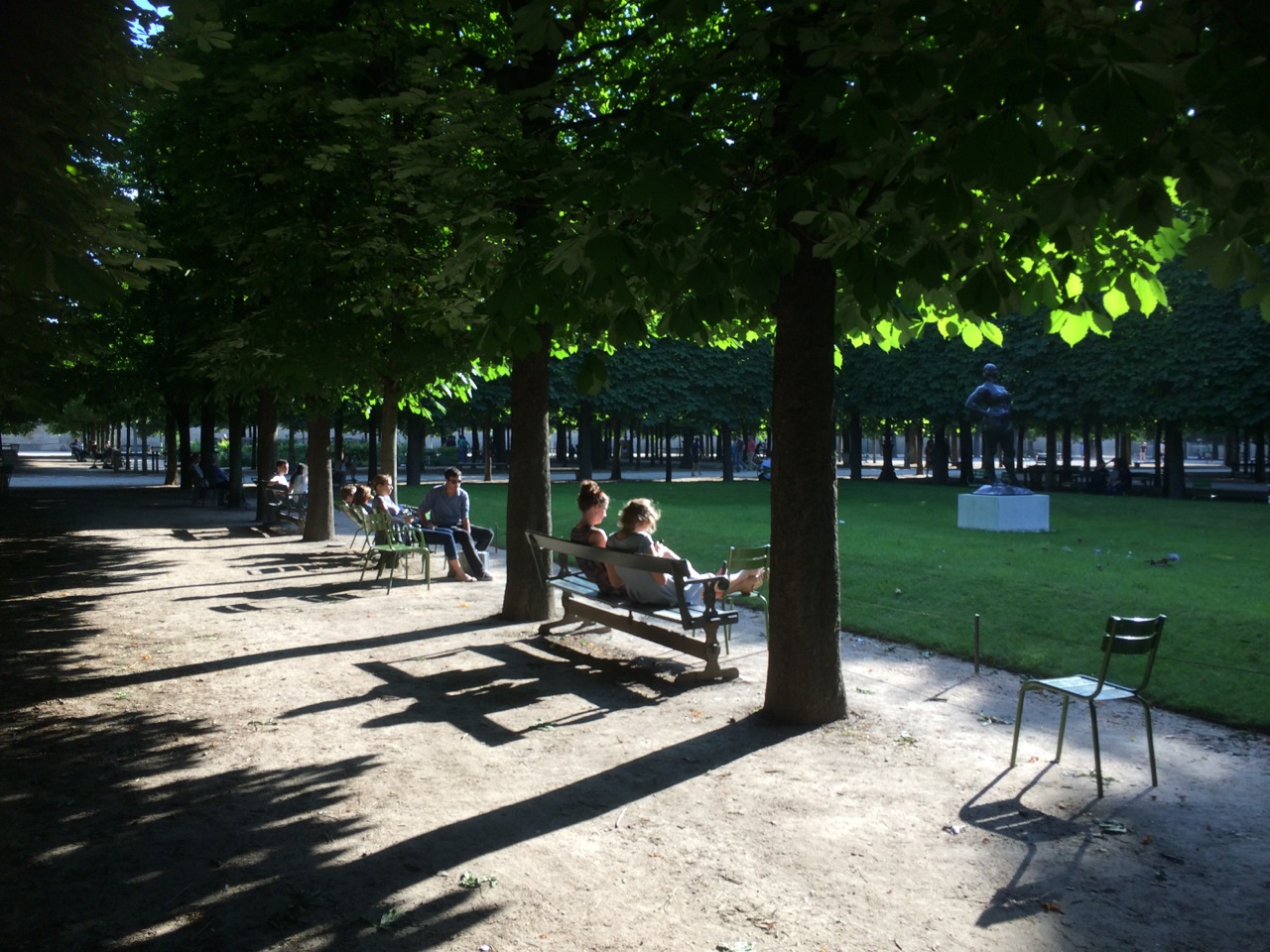
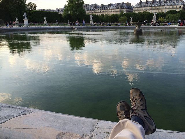
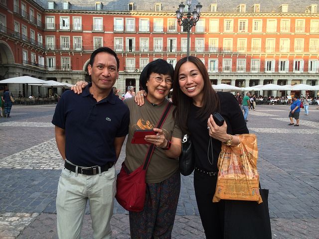
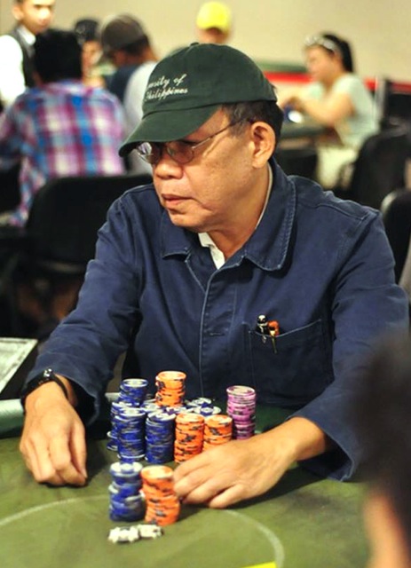
What we’ll remember most from this trip is a leisurely walk through the Jardin des Tuileries, across the bridge to the Musee d’Orsay, then back to the big fountain in the park, trying to take in the immense joy and gloriousness of a spring day shared with the one person you’d like to see the world with. It was the gift of a lifetime, for which Beng and I would like to thank Demi, Jerry, and the gods of poker.
 Penman for Monday, May 5, 2014


 Penman for Monday, February 24, 2014