
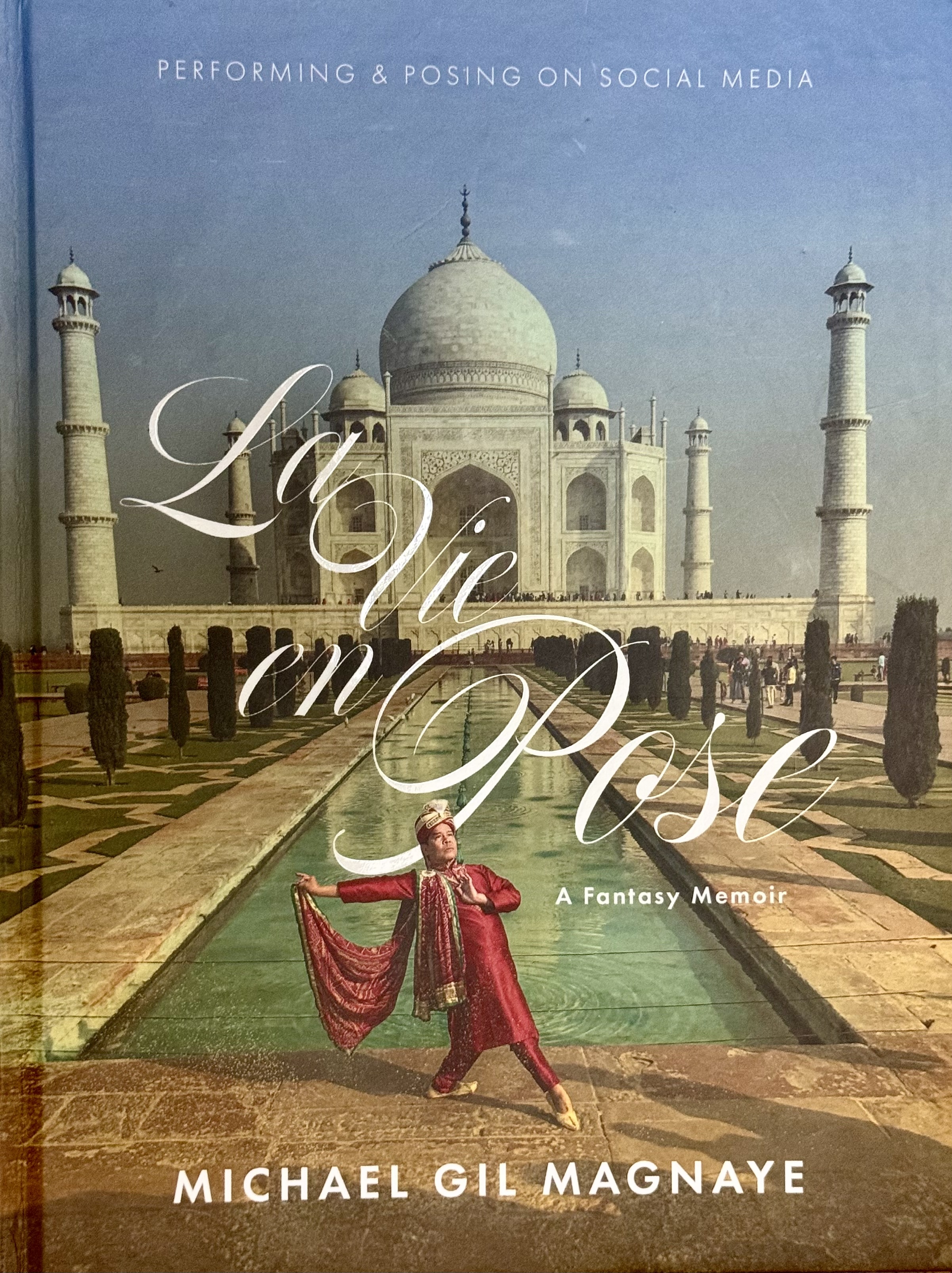
Penman for Sunday, April 5, 2026
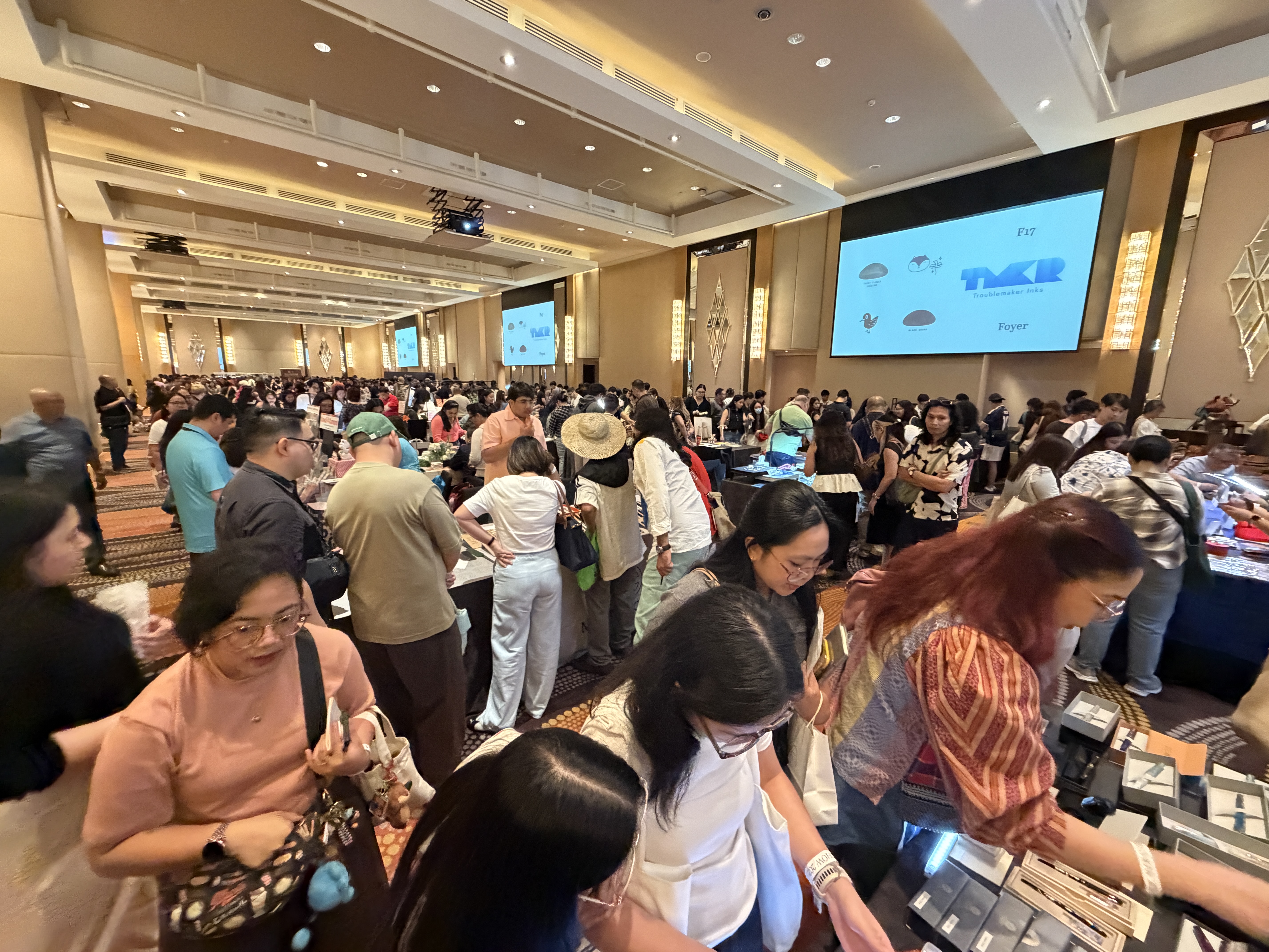
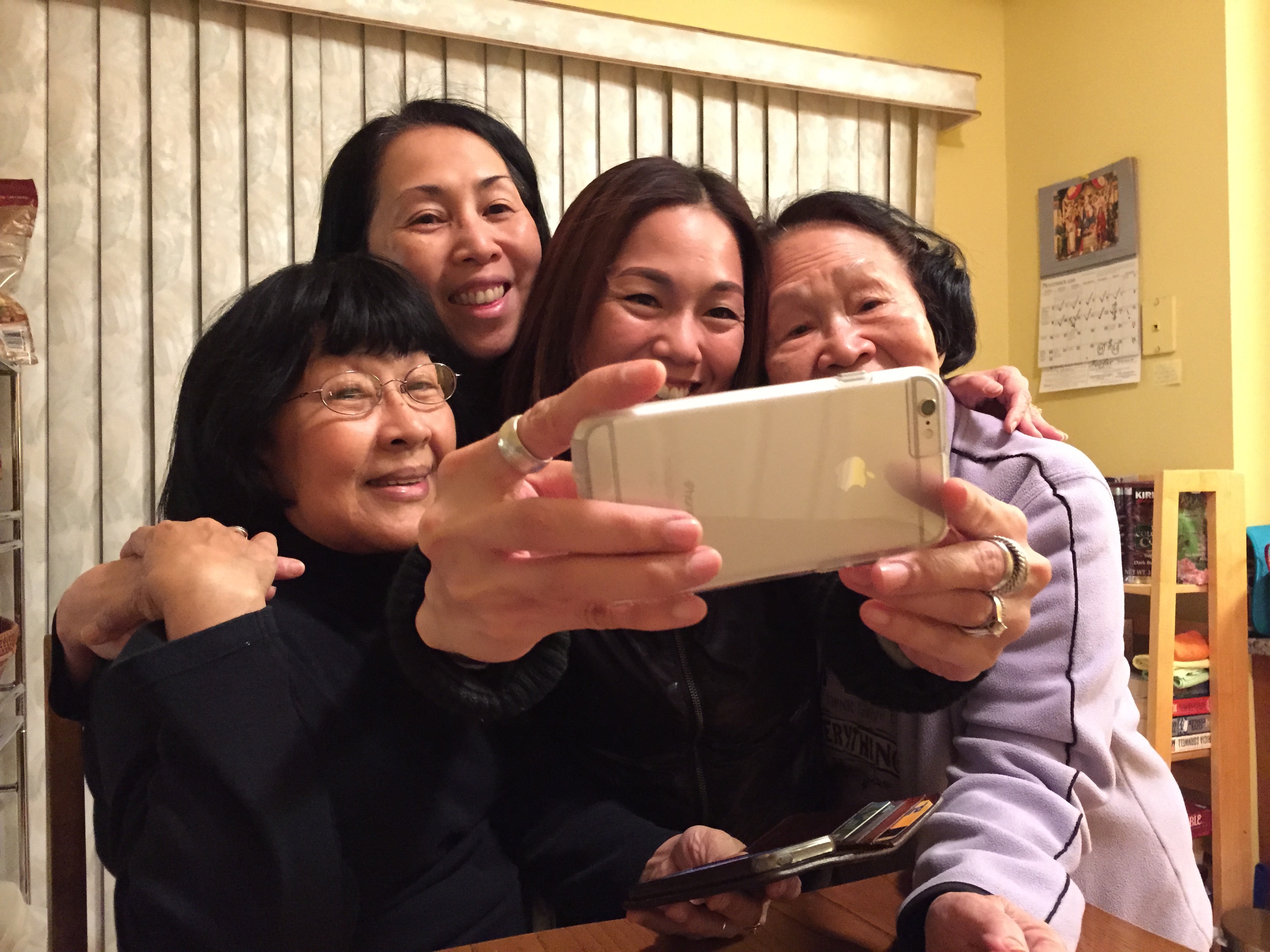
LATE LAST month, over two frenetic days at the Fairmont Hotel in Makati, more than 3,000 attendees crowded into a ballroom and the corridor outside for the sixth iteration of the Manila Pen Show since 2018. Not only did dozens of dealers and vendors coming from as far away as Russia and Turkey offer trays and tables full of pens, inks, and other writing paraphernalia. Seminar rooms were packed full of people learning how to adjust nibs, use fountain pens for painting, and master calligraphic strokes. What was most obvious and rather surprising was that the vast majority of attendees weren’t old fogeys like me who grew up with fountain pens, but young professionals and students eager to get their first Sailor, Pilot, or Pelikan—or even a five-figure Montblanc or Nakaya.
The MPS is run by the Fountain Pen Network-Philippines, a group of enthusiasts that began with 20 people in our front yard in 2008. Now FPN-P counts 16,000 members online, from the Philippines and parts beyond—and if you think most of those people are idle lurkers, wrong: more than 9,000 of them participate actively on FPN-P’s Facebook page. And again, here’s the killer factoid: the group’s median age is somewhere between the late 20s and early 30s, clearly marking a demographic shift in the hobby from my fellow dinosaurs to the young bucks.
And it isn’t just pens. Everywhere around the world, young people are picking up and using typewriters, mechanical watches, film cameras, vinyl records, and pretty much anything older than they or even their parents are. They’re even wearing (after actively hunting down and paying big money for) torn jeans and ratty flannel shirts from the 1950s.
The romance of retro is definitely in the air. Whether it’s old tech or vintage clothing, the urge to try something old is palpably present, and “palpable” may be apt, because much of this fascination, according to the experts, has to do with the sense of touch.
Beth McGroarty, the research director at the Global Wellness Institute, argues that “studies show that people are hardwired for things like touch from infancy,” and frames the analog revival as “a rebellion against that shapeless, disembodied, throwaway digital world of screens, and a hunger for physical objects and tools that are touchable.”
That’s certainly true for fountain pens, which are as tactile as tools can get, and with which users establish intimate relationships. The act of writing with a pen represents the completion, commitment, and communication of an idea, a thought that starts from the writer’s brain, and gets processed by the writer’s emotions as it travels to his or her fingertips. The pen’s nib and ink commit the thought to paper and give it permanency, but also mediates it—you can often tell what the writer’s mood is by the shape and the sharpness and the fluidity of the written word. For young people growing up with keyboards, cursors, and block letters on an indifferent screen, nothing could be more different, because more personal, more “Me!”
That’s true even for typewriters, which—thanks largely to Manila-based repairman Gerald Cha and the Filipino Typewriter Collectors group on Facebook (yes, I’m also one of the organizers)—have attracted many young enthusiasts. They seem to be little more than clunky pre-computers at first glance—metal machines using greasy ink ribbons without “delete” buttons and no connection to the Internet—but it’s precisely this isolation that’s become its main draw for young users.
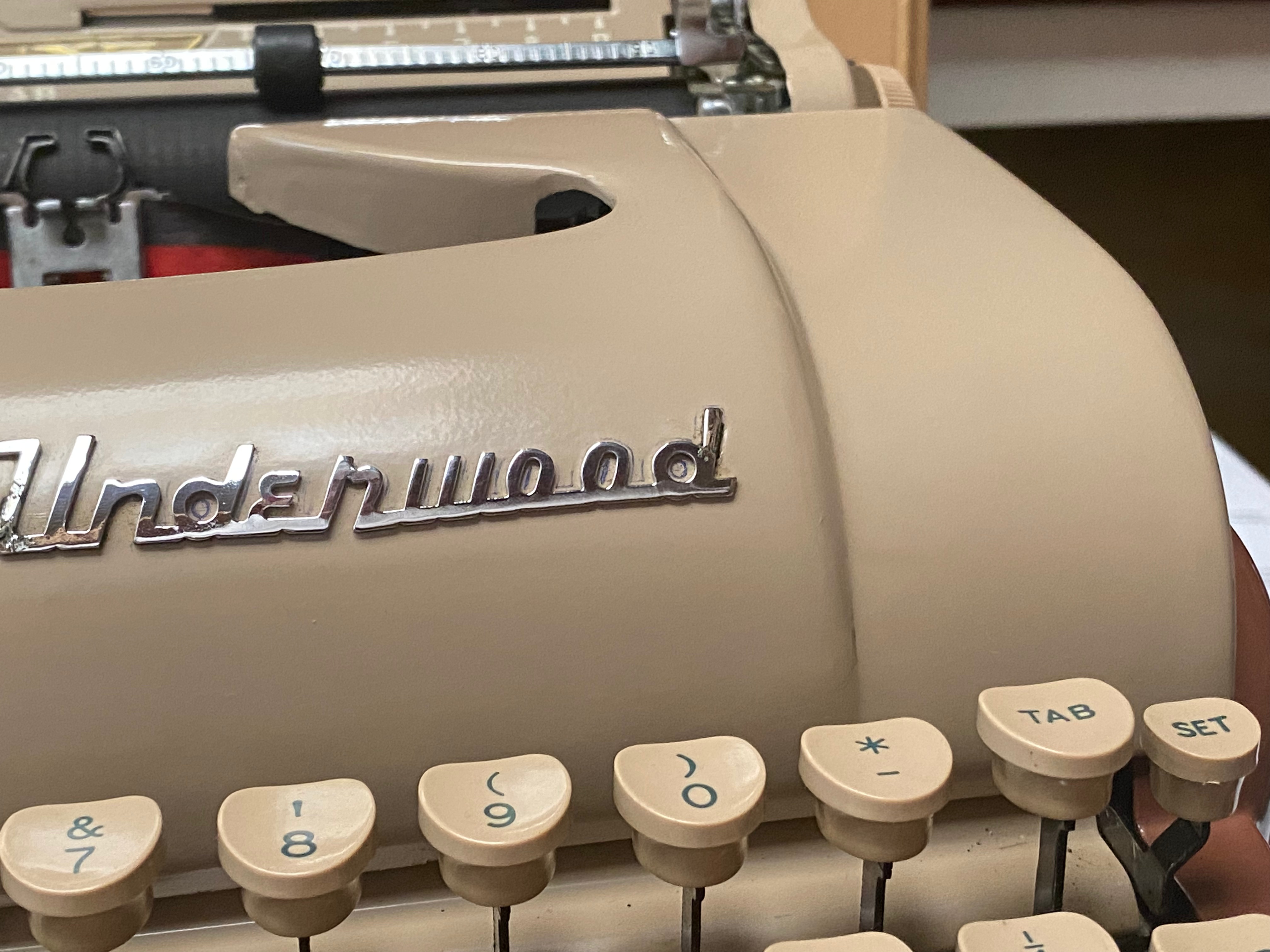
According to Walid and Joujou of Mr & Mrs Vintage Typewriters in the UK, who have restored thousands of machines over the past decade, the soaring interest has been driven by what they call “a craving for authenticity and quiet.” Now “quiet” isn’t a word you normally associate with the clackety-clack of an Underwood or a Remington. But take typing as a rejection of digital noise, which is what the many thousands of typewriter collectors around the world profess to like about their Olympias and Olivettis—complete disconnection from the outside world, replaced by total focus on what you’re typing, which you can’t simply erase without making a mess. Handwriting and typing demand deliberation.
So does, for that matter, film photography, to which young people are returning in droves, as if film were some holy membrane to be treated with respect if not awe (an attitude encouraged by the eye-watering price of film plus processing). I have a good friend who, like many millennials, turned away from megapixels and pocketable phone cameras to embrace expired Tri-X and clunky RB67s. I’d kid him about spending a fortune on his new passion and for thinking every shot through before pressing the shutter button—the mark of the classic photographer, a la Henri Cartier Bresson in wait of the “decisive moment”—only to send the roll through for digital conversion. But I can understand his commitment, because it’s about more than photography; it’s a decision to take fuller control over sensors and algorithms, to almost literally stamp one’s vision over the image, in defiance of AI, putting natural beauty over artificial prettiness.
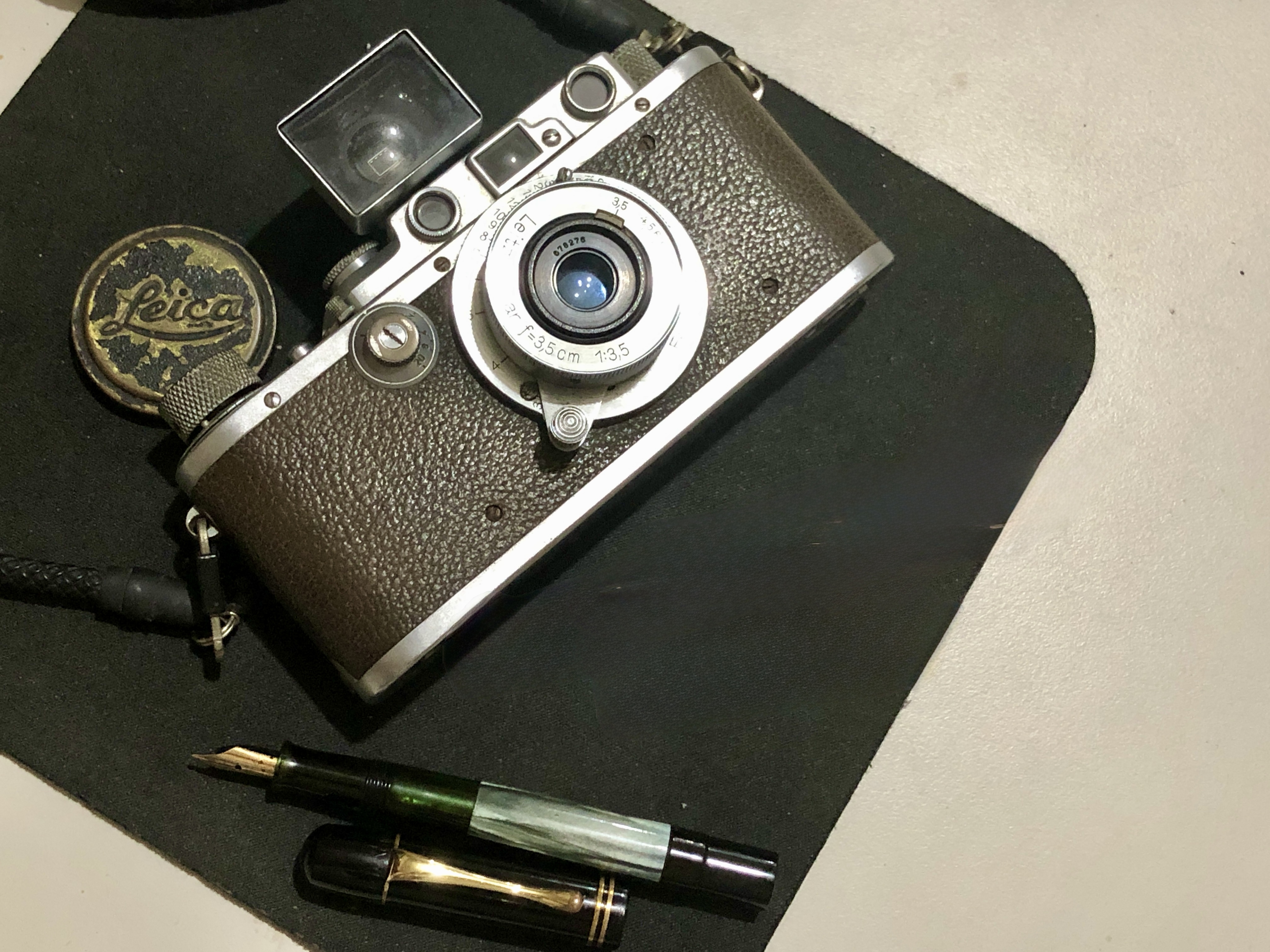
And then there’s the element of what researchers call “meta-nostalgia,” a longing to capture and reinterpret the past on one’s own terms. In a world hurtling forward into the void, the imagined past offers clarity and security, if only because it already happened. Writing with a pen—especially a vintage one that your Lolo or Lola might have exchange love letters with—returns us to a fantasy of innocence (forgetting, of course, that someone like Josef Stalin signed death warrants with a tiny Pelikan 100–the pen beneath the Leica in the pic above).
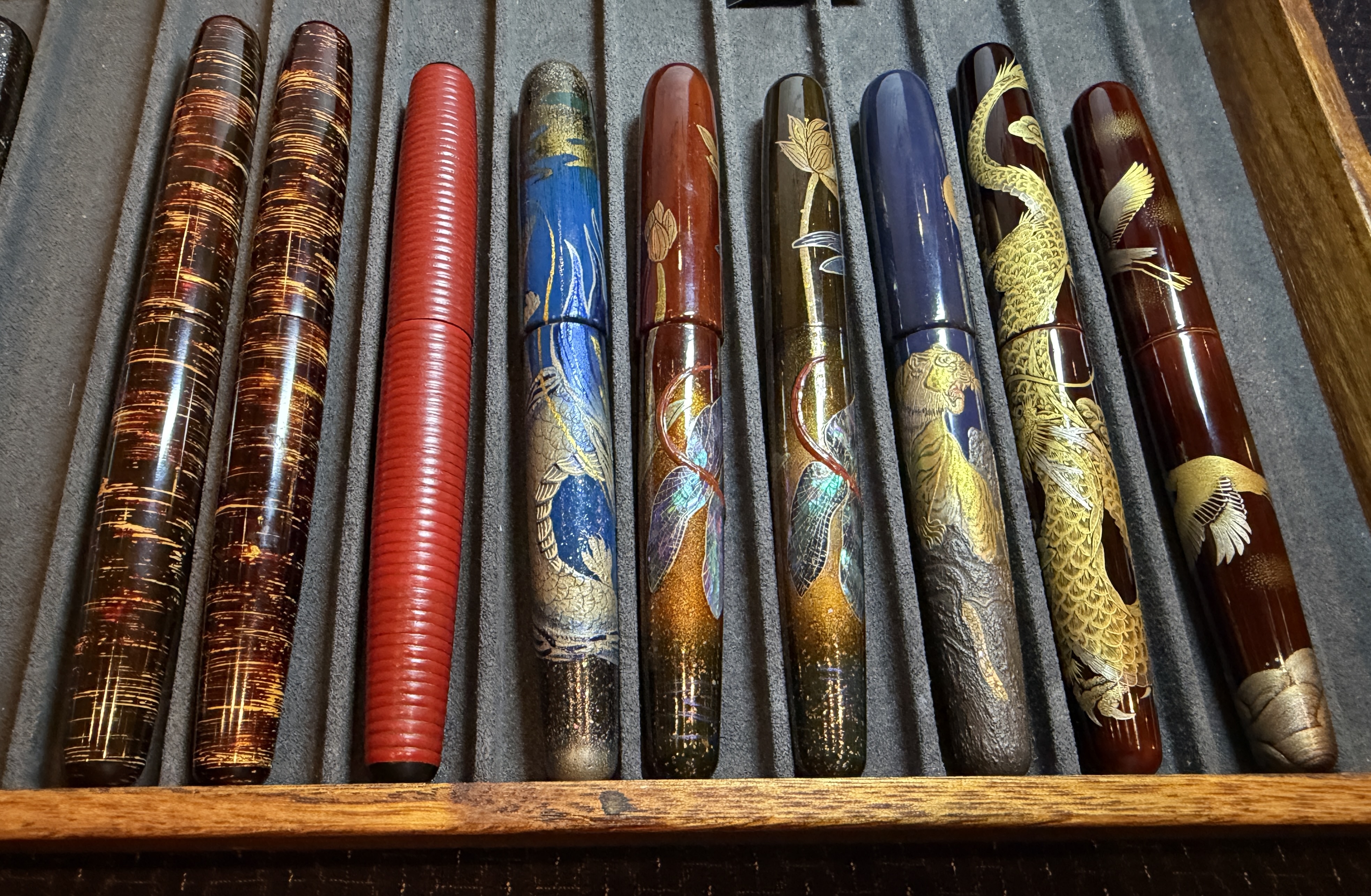
But returning to pens, it was clear from the MPS that this wasn’t a jump back to the ‘40s or ‘50s, except for the few of us who specialize in that period. The “kids,” as Beng and I like to call them, were buying pens to play with, employing a raft of designer inks that not only sheened but shimmered, most definitely no longer your Lolo’s reliable blue-black Quink. They also brought and bought journals, cases, stamps, washi tapes, and such accessories as make not just a hobby but indeed an industry.
Retro is back with a vengeance, and as we oldies—the so-called “OGs”—sat back and marveled at what the young ones were willing to spend on what we used to think of as no more than writing tools, one of them came up to us with a flashy pen and said, “In fifty years, this will be vintage!” Indeed. Sooner or later, we’ll all belong to the past, and as today’s Gen Z’ers are beginning to realize, it can be far more fun and comforting than the uncertain future.
Email me at jose@dalisay.ph and visit my blog at http://www.penmanila.ph.


 Penman for Monday, August 5, 2019


 I TOOK these shots of dried fish in Cebu some years ago–something ghostlike about them fascinated me.