Penman No. 448: Designing for the Eye and Mind

Penman for Sunday, March 5, 2023

I DON’T normally review books—even books sent to me with a request to be reviewed, which I apologetically ask authors not to do, unless they’re willing to wait a year or two. That’s because I prefer to enjoy books rather than to critique them, which sounds too much like the kind of work I happily retired from. But every now and then, along comes a book I simply can’t ignore, because it’s just too important or maybe just too beautiful to be put aside.

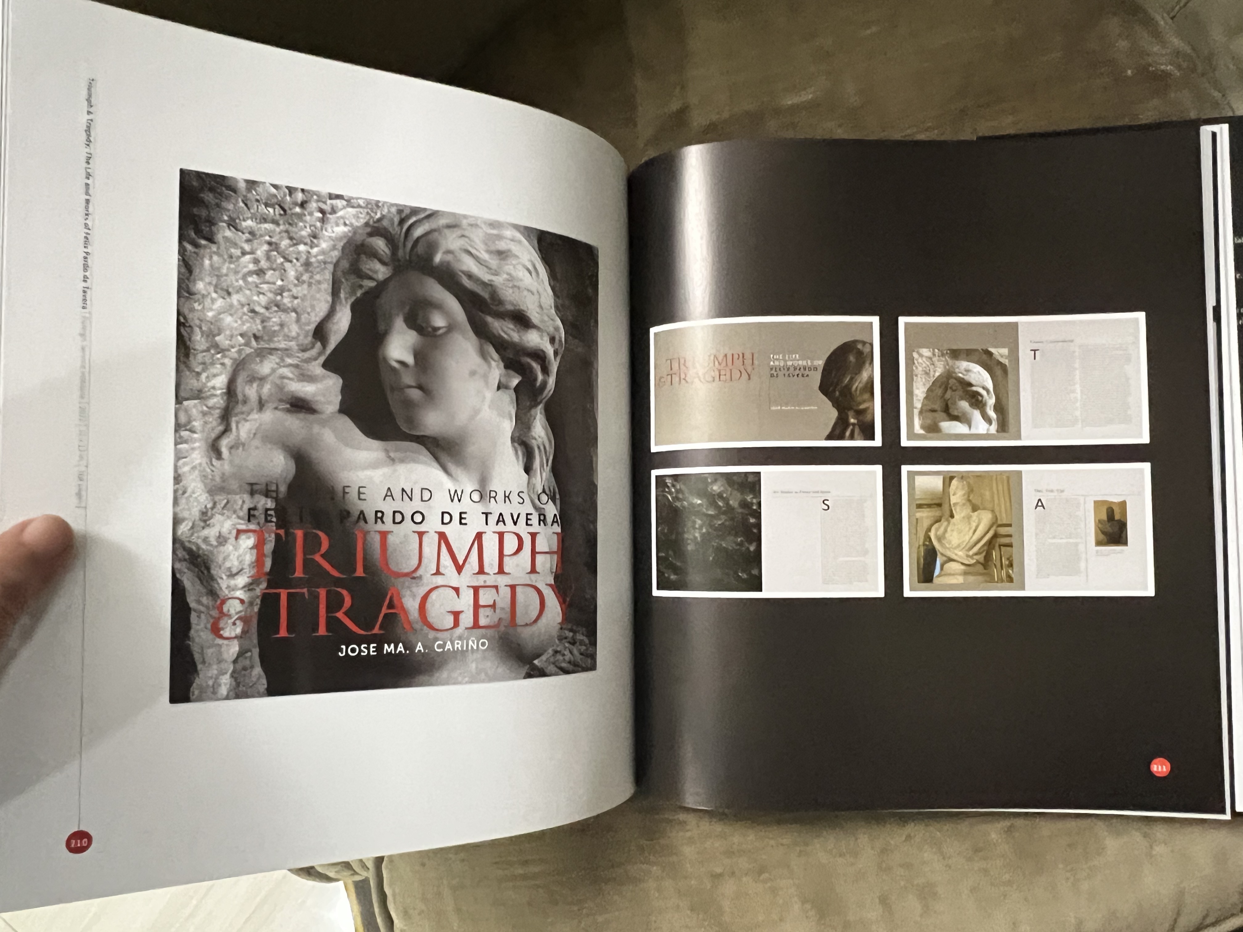
One such book—both important and beautiful—was dropped off at my doorstep last week, and as soon as I opened it, I knew I had to share my knowledge of its existence with fellow enthusiasts of art and design. The book was Felix Mago Miguel: The Art of Book Design, written by Felix’s wife Amelia F. Zubiri-Miguel, edited by Ambassador Jose Ma. Cariño, and published by the Foreign Service Institute.

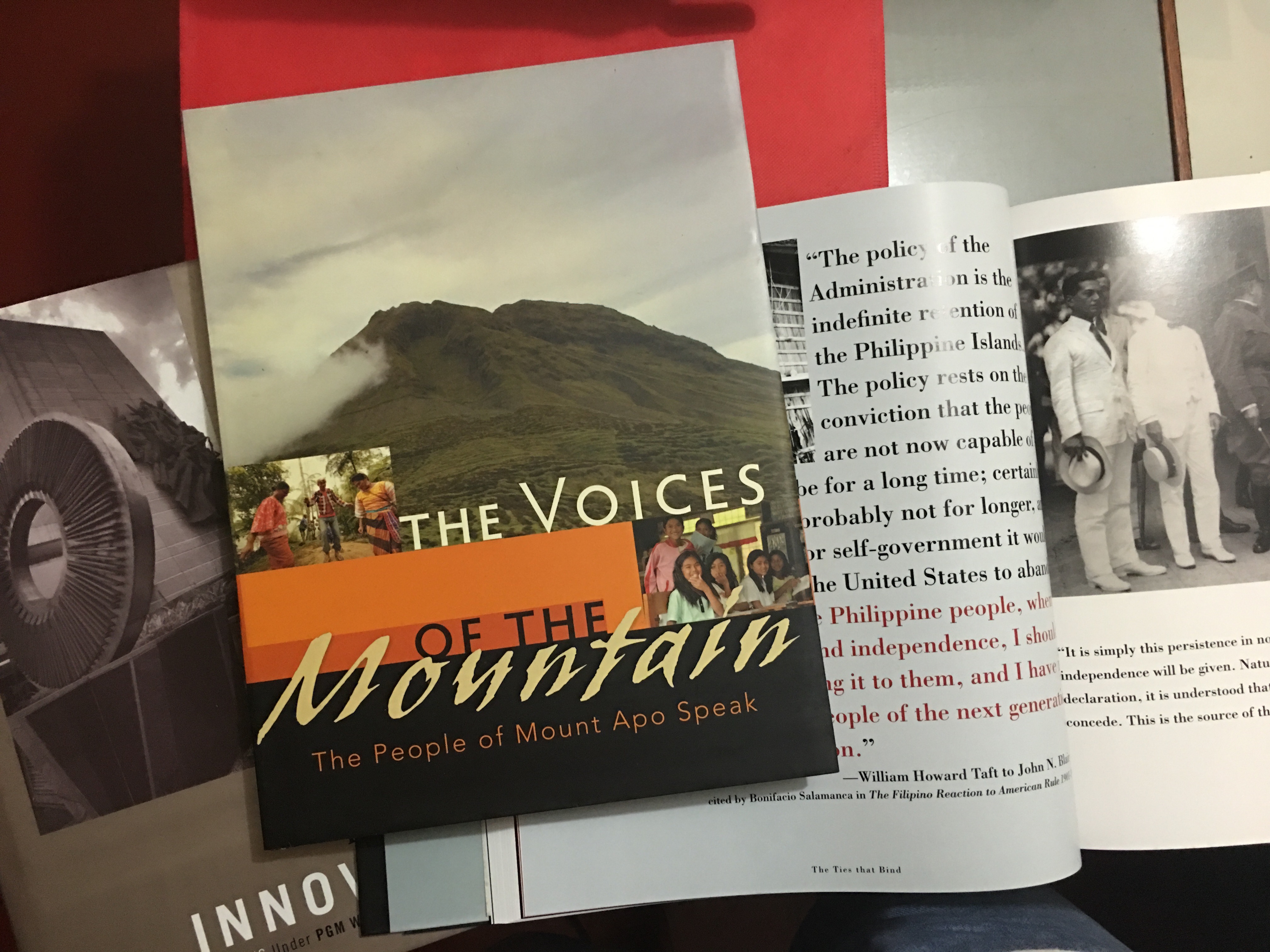
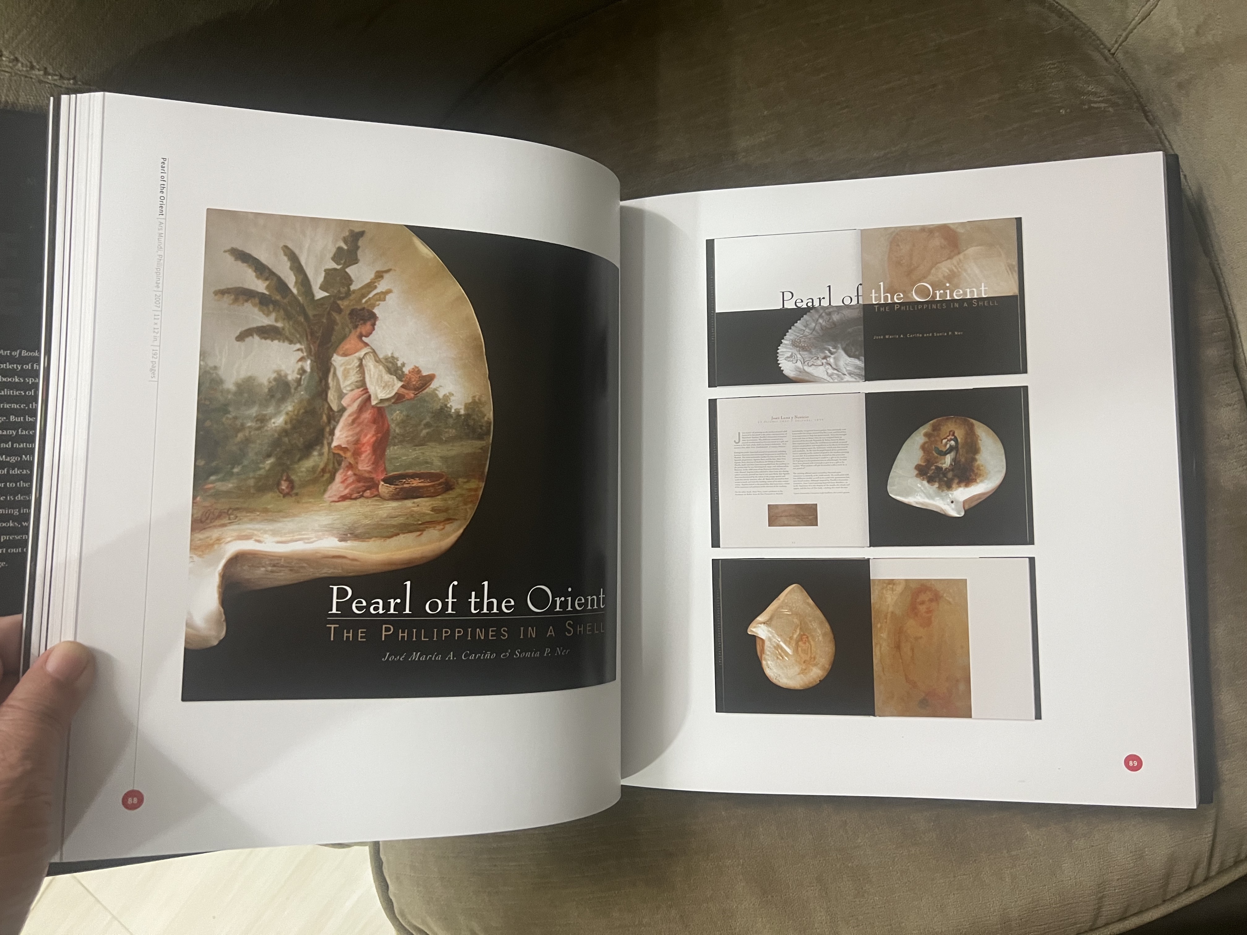
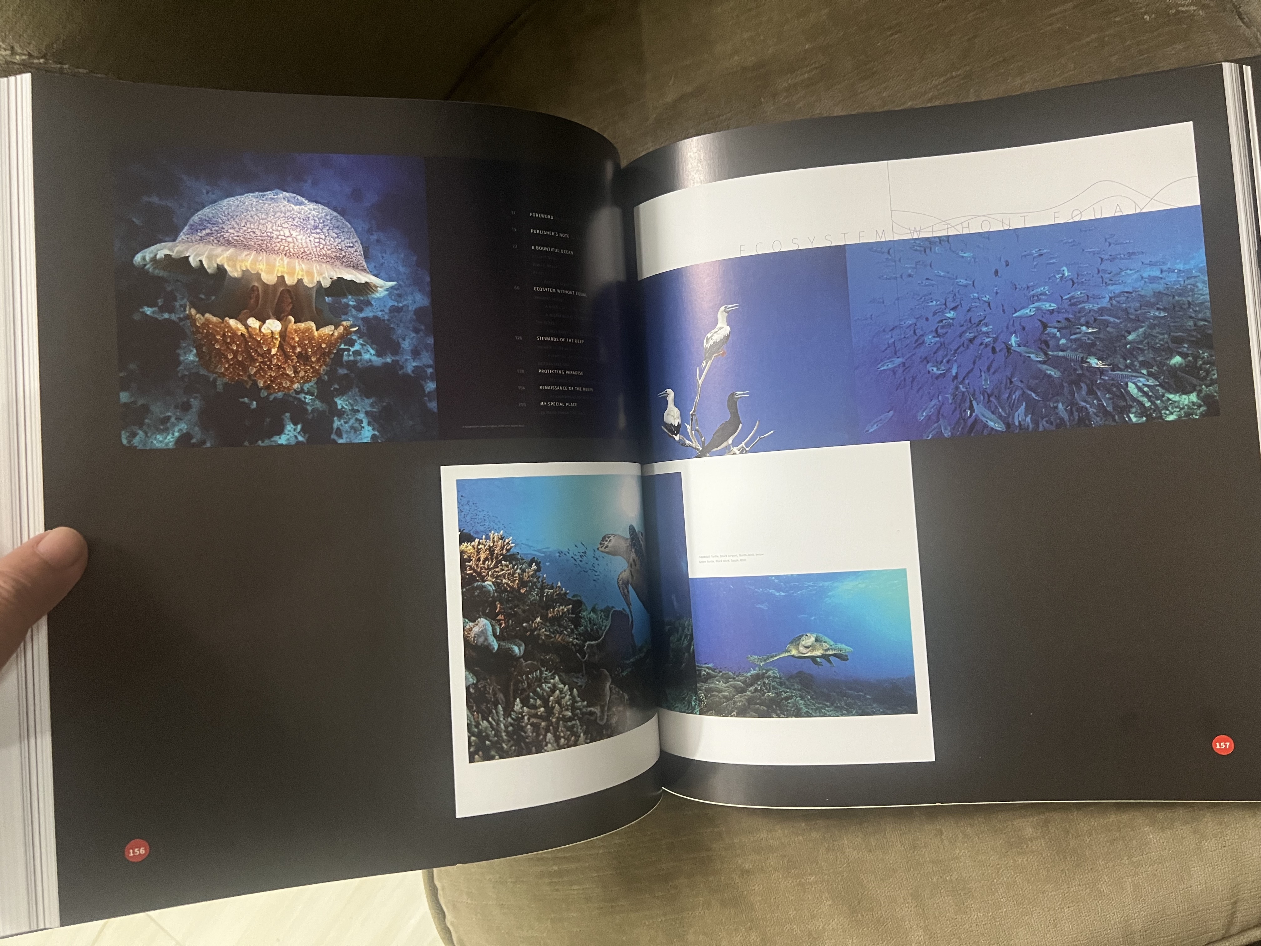
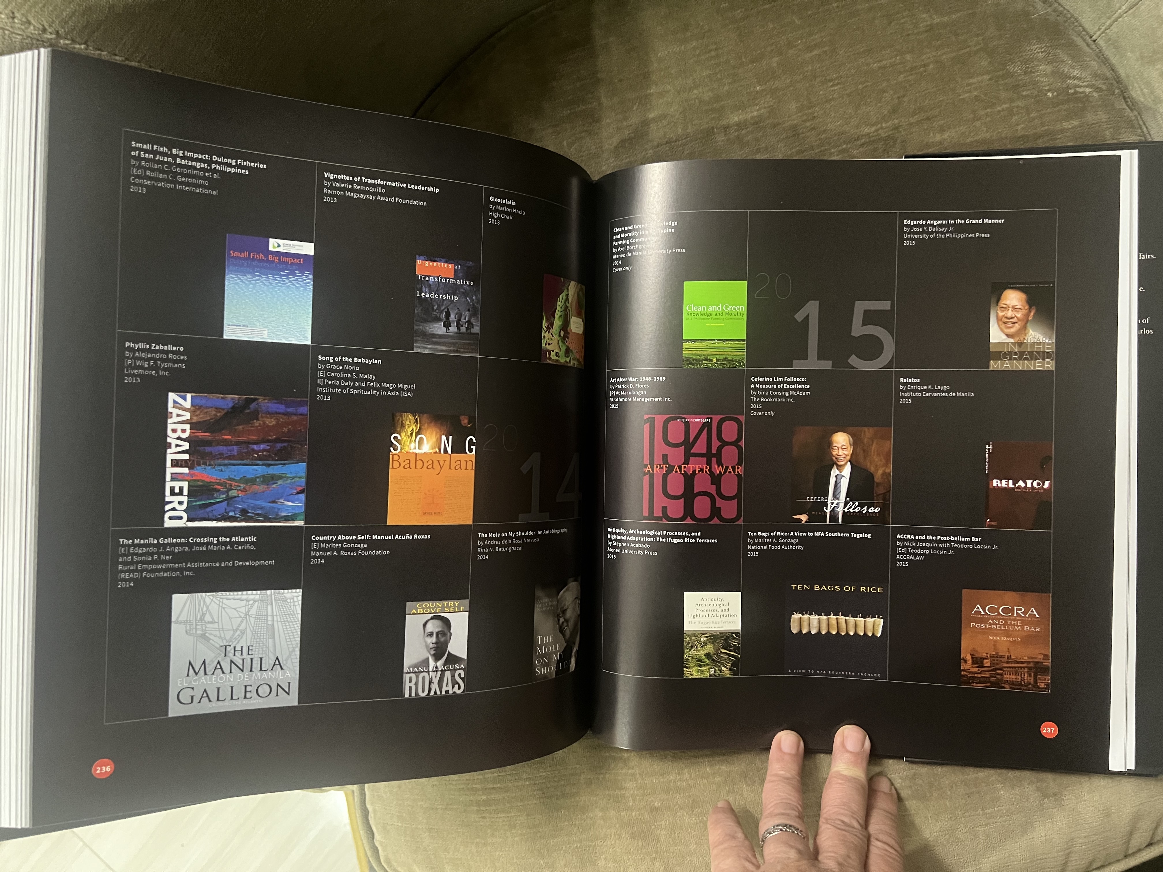
One of the most talented and prolific Filipino book designers of our time, Felix has designed more than 130 books over the past 20 years, and I’ve been fortunate to have authored and edited a good number of those, including several coffee-table books and the biographies of Edgardo J. Angara and Leonides S. Virata. This hefty 264-page book is a biography, treatise, and catalogue all in one, a fine embodiment and example of its own subject, sumptuously produced not just to showcase Felix’s work but also to discuss his theory and experience of book design.

Ours has always been a country of gifted authors with endless stories to tell, but only recently has enough attention been paid to the proper design, production, and marketing of our books. The growth of Philippine publishing and the opening of foreign markets to Philippine material has spurred some of that interest as a matter of economic necessity, but the general appreciation of book design remains low. 

As an author myself, I’ve always been fussy about how my books look; I didn’t work that hard just to come out with an ugly book with my name on it. But sadly not all authors or publishers share that worry. As Felix himself laments, we Pinoys have a famous fear of spaces—horror vacui—and tend to cram our pages with as much text as we can, as if wide margins (and better readability) were a waste of precious paper.

Coffee-table books, which are Felix’s particular area of expertise, present both special challenges and opportunities. Being typically meant for promotional rather than commercial purposes, CTBs have large budgets that will allow for better production. But a poorly thought-out or executed design can render those millions useless. I’ve groaned at obviously expensive book projects ruined by gaudy or overly busy covers, barely readable type, narrow margins, and bad paper. (One of my biggest pet peeves is printing text over a photograph for that artsy effect, rendering it illegible.)

Felix’s background as a painter (and as a graduate of the Philippine High School for the Arts and the UP College of Fine Arts) allows him to see a book project not just as a technical challenge but also an intellectual exercise—a process of understanding what the book really wants to say, and translating that into a visual language.

“A book project is always like a thesis, a problem to be solved, an experience to be fleshed out,” he says. “Everything for me begins with figuring out what the book is trying to say and how best to say it. I do my best to learn the narrative, reading to understand it, absorbing its contents. If there are visuals already, I go through them, looking for the narrative that I just read among the photos and illustrations. Doing these things enables me to better feel the book and the direction it will go. My goal is to find the personality of the book, to figure out who is talking and to decide on what kind of experience is best—to design the book in such a way that, as Rita Jacobs says, it may be the only way that it can be presented.”

He designs as much for the mind as for the eye. As Amelia puts it, “Though people may say that a designer’s job is all simply a matter of art, my years of seeing Felix working have told me that it is not. At the end of the day, he always ends up more knowledgeable, better informed, and wiser with insights not just from the manuscripts but from the totality of the discussions and the time he had spent with his clients, which is probably the best bonus and priceless privilege that comes with the job, because at the end of every project, a really beautiful book needs to be more than just pretty to look at.”

Felix adds: “As designers, we become builders of experience. We may not have the privilege of letting our audience touch the skin or the sinews of what they are looking at, but if we did well in our work, what one designed becomes an exhilarating, unforgettable experience. Not only do we introduce the authors and their voices, but through a well-designed book, readers may experience the same things vicariously. What is separated by time and space is connected through emotions. And a book that touches your soul is indeed an experience to be cherished.

“After learning the technical aspects of design—the use of typography, colors, spaces, photos and illustrations, pages, covers, and printing—I realized, I have a new medium. And just like in painting, the medium is not the end of the painting; it is just part of it, because more importantly, there is a story to be told and that story is the priority of the design. My role is to ensure that this invisible visual force will allow the story to be told.”

And tell the story Felix does, in an inimitably pleasing and tasteful style that more than does justice to his material. I look forward to our next project together, whatever that may be—a writer can only write better knowing how superbly his work will look in a capable designer’s hands. 

Penman No. 240: Cebu Goes MAAAD

img_0860

Penman for Monday, February 27, 2017


THAT’S MAAAD as in “Master of Arts in Applied Arts and Design,” a new degree program recently launched by the University of the Philippines Cebu in collaboration with Taiwan’s Shu Te University (STU).

And what’s the big deal about this new offering? Well, it taps into one of Cebu’s native strengths—its deep roots in artistic expression, coupled with cutting-edge technology—while bringing Cebu in direct contact with leading global knowledge centers like STU.

Cebu, of course, isn’t just one of the country’s major economic and political capitals. It’s also home to rich cultural traditions in painting, literature, music, dance, theater, and film, among other genres. It’s no surprise that it gave birth to a world-class talent like furniture designer Kenneth Cobonpue, who graced the launch of the MAAAD program along with Cebu City Mayor Tomas R. Osmeña, UP President Danilo L. Concepcion, UP Cebu Chancellor Liza D. Corro, and CCAD Acting Dean Jocelyn Pinzon. STU was represented by its former President Dr. Chu Yuan Hsiang and Dr. Eing Ming Wu, among others.

The cooperation between UP Cebu and STU is no accident. Cebu and Kaohsiung are sister cities, an unusually strong relationship made visible by the proliferation of modern “Kaohsiung” buses in Cebu. It implements the Taiwan-Philippines Academic Networking Platform which was forged in May last year between UP and the Southern Taiwan Universities Alliance, following a visit to Kaohsiung by a UP team led by then President Alfredo E. Pascual and UP Open University Chancellor Grace Javier Alfonso.

“We in Taiwan have usually focused on Western countries like the US, Canada, Australia, and New Zealand, neglecting an English-speaking country much closer to Taiwan, the Philippines,” noted the ebullient Dr. Wu, who would email me upon his return to Kaohsiung to report that “I am overwhelmed by the new momentum created by our partnership. At this moment, ten UP Cebu students plus one chaperone have arrived to visit physiology labs in three different distinguished universities. They will be staying at the UP Guest House in Kindness Hotel, a facility we set up to host our Filipino visitors. Another batch of six UP Diliman faculty members will be in Kaohsiung to seek matches with Southern Taiwan universities for their PhD degrees from February 28 to March 3.”

UP Cebu is uniquely positioned at the nexus of tradition and innovation. It’s the UP System’s eighth and newest constituent university, but it will be celebrating its centennial as an educational institution next year. The age shows in the old college building along Gorordo Avenue, but don’t let the antique charm fool you—a laser cutter and 3D printer are busy at work in another wing next door. For its part, and although relatively young, STU has already won prestigious international awards for its students’ work in communications and design, including the iF Student Design Award in 2016.

The new MAAAD program promises to be both challenging and rewarding. To be administered by UP Cebu’s College of Communication, Art, and Design (CCAD), the 36-unit, four-semester program will cover courses in research, digital content design, product design, fabric design, technology, and art, among others. Classes will be taught by instructors from STU at UP Cebu’s new campus at the South Road Project—a huge reclamation area that promises to be the city’s new boomtown—but students will defend their theses and receive their diplomas at STU in Kaohsiung. (Mayor Osmeña had made the five-hectare SRP lot available to UP.)

MAAAD faculty and students can bank on laboratories and facilities comprising UP Cebu’s FabLab (put up with DTI support), fine arts workshops, and the CCAD’s computer laboratory. It won’t be cheap, with tuition running at nearly P60,000 per semester, but a scholarship scheme is being discussed. Besides, explains Chancellor Corro, “We expect many of our students to be working professionals for whom the program will present expanded opportunities for further growth.”

In his remarks, Kenneth Cobonpue made a wry reference to the fact that UP turned him down years ago when he applied to its Fine Arts program after failing his drawing exam. He later found his true calling in industrial design. The MAAAD program should now make sure that no design geniuses are turned away at the door, ever again. For more information, email maaad.upcebu@gmail.com. The deadline for applications is July 15.


ON BEHALF of my old office, the UP Institute of Creative of Writing (UPICW), I’m also glad to announce the fellows to the 56th UP National Writers Workshop to be held on March 12-19, 2017 at the BP International Makiling, Los Baños, Laguna. Twelve writers have been selected for the workshop, to be led by this year’s workshop director Vladimeir Gonzales.

The 2017 fellows are Arbeen Acuña (Fiction, Filipino), Christa de la Cruz (Poetry, Filipino), Zeno Denolo (Fiction, Filipino), Rowena Festin (Fiction, Filipino), Rogene Gonzales (Fiction, Filipino), Arvin Mangohig (Poetry, English), Arnie Mejia (Creative Nonfiction, English), Paolo Enrico Melendez (Creative Nonfiction, English), Charisse-Fuschia Paderna (Poetry, English), Wilfredo Pascual (Creative Nonfiction, English), Karren Renz Seña (Fiction, English), and Alvin Ursua (Poetry, Filipino).

See you all next month in Los Baños!


SPEAKING OF Cebuano artists and writers, I was very sad to hear about the passing after a long illness of a colleague and friend—and one of UP’s and Cebu’s most outstanding art scholars and critics—Dr. Reuben Ramas Cañete. Reuben was also one of the stalwarts of the Erehwon Center for the Arts, and we went to the US together last July on Erehwon’s behalf to pitch hard for the establishment of the American Museum of Philippine Art. More than that, he had been one of my daughter Demi’s favorite teachers when she was an Art Studies major, and my wife Beng was a dear friend of his to the last. Reuben left an indelible impression on everyone he met with his prodigious knowledge, his acerbic wit, and his passion for books and learning. Godspeed, Reuben, and see you in that great gallery in the sky!


Penman No. 181: A Designer on an Island

IMG_7775.jpg

Penman for Monday, January 4, 2016


ONE OF the side benefits of our recent visit to Bohol was an opportunity to reconnect with an old friend and professional colleague, the prizewinning book designer Felix Mago Miguel, who has chosen to live and work in Bohol for the past ten years with his wife Amel and their five children.

Beng and I had known Felix for a long time, since she saw and bought some of his paintings and gifted the then-newlyweds with her own painting and some plates by the potter Lanelle Abueva-Fernando. (“The plates are all gone now, because we used them and would break one every year,” said Amel apologetically, “but the painting’s still there!”) Felix and I had worked together, as writer and designer, on some coffee table book projects, notably those on Philippine-American relations, the Mt. Apo geothermal project, and the Government Service Insurance System. After my early collaborations with the late, lamented Nik Ricio, it was a relief and a pleasure to find the young and talented Felix, who has rightfully taken over Nik’s mantle as one of the country’s most sought-after book designers.

We invited the couple over to lunch at our hotel and we had a nice long chat about life, work, and what it’s like to keep on top of your profession from an island far from the country’s business and cultural center.

“Honestly, it hasn’t been all that difficult,” said the former Manileño. “In fact, I didn’t tell my clients for a whole year that I was working from Bohol because they might worry about my accessibility and meeting deadlines and so on. But with the help of the Internet and by scheduling my trips to Manila, I’ve been able to cope with the demands of the job. I use WeTransfer and Google Drive to move large files online, on my SmartBro account.”

Amelia Zubiri was born in Bohol, but also grew up and went to school in Manila, where she and Felix met in UP Diliman, where Felix was a Fine Arts major, graduating in 1992. They decided to move to Bohol to get away from Manila’s toxic atmosphere and to raise their children, now aged 16 to 7, in a healthier and more relaxed environment; all the children—the twins Ulan Kalipay and Ulap Namnama, Angin Kalinaw, Araw Naasi, and Langit Biyaya (the only one born on the island)—have been home-schooled. Deeply spiritual, the Miguels have learned to repose their trust in Providence, and their faith has been well placed.

When a huge earthquake devastated Bohol on October 15, 2013—just two weeks before supertyphoon Yolanda ravaged the Visayas—the Miguels and their one-storey home emerged shaken but unscathed, and they shared their good fortune by helping out with relief efforts. “The earthquake was a life-changer for many Boholanos,” Amel reflected. “It encouraged many Boholanos who had left for jobs overseas to come home and spend more time with their families. Seeing the new houses they had painstakingly built crushed in seconds seemed to remind them that nothing was more important than time together.”

Most of these OFWs work as seafarers, an occupation historically favored by Visayans. “It’s not uncommon for a Boholano family to have one or two seamen working on ocean-going vessels,” said Amel. “You can tell the houses that they build with their remittances by little design elements like anchors and portholes,” added Felix, smiling.

Felix Mago Miguel’s own journey to the crest of the book design business is a story of good breaks, sheer talent, and perseverance. Now 44, he started out in 1996 by designing Soledad Lacson-Locsin’s landmark translations of the Noli and Fili for Bookmark. “I’d done book covers before, but this was the first time that the publisher, Lori Tan, let me do everything from cover to cover,” said Felix. Later that same year, another book project, Water in the Ring of Fire: Folktales from the Asia-Pacific, edited by Carla M. Pacis, won for Felix his first design award from the National Book Awards. Since then, he has designed over a hundred books, some of them winning him recognition from the National Book Awards and the Gintong Aklat competition.

It isn’t the awards, however, that drives him to excel in his craft, but the satisfaction that he gets out of seeing a happy client. The project that has given him the most pleasure has been XYZ: The Creativity of Jaime Zobel, which drew on Zobel’s three decades of work in photography and art. “Don Jaime was so ecstatic about the book that he told me he needed to take a Valium to calm down,” recalled Felix. It’s that kind of reception that drives Felix to spend long nights staring at a computer screen, poring over one image after another.

The most technically challenging was Cuaresma, put together by Cora Alvina and edited by Gilda Cordero-Fernando and Fernando Zialcita, and winner of the National Book Award in 2000. “This was before digital photography, and I had to work with a huge box of color slides,” said Felix. But then again, “The technical aspects of book design are often easier to deal with than some people behind the books,” Felix confessed.

Like me, he’s had his share of good book projects that, for some reason or another, went nowhere. He did get paid for work done, as I was, but it’s such a waste of labor and good material when a project that seemed so promising never sees the light of day, because someone in the production process fails to deliver, or because the clients themselves lose interest or change their minds. Thankfully for Felix and me—as I wrote in this column a few weeks ago—coffee table books remain in high demand, and I expect to be working with him again on one or two forthcoming projects soon. One current project he’s excited about is a book on native Philippine trees that he’s doing for the Lopezes.

While he’s based in Tagbilaran, Felix flies out to Manila to personally check on his projects in the press. This used to be done abroad for high-quality printing jobs, but local printers have expanded and improved significantly enough to take on the challenge. “Our best local printers like House Printers can now compete head to head with their counterparts in Hong Kong and Singapore,” Felix said. (House Printers produced one of my most recent books, the biography of former Sen. Ed Angara.)

He misses painting, and spoke wistfully about the last big painting he did, a mural for the Church of Gesu on the Ateneo campus in Quezon City. But the children, the Miguels said, seem to be taking intuitively to art; Felix and Amel have monitored their time online to make sure that they can attend to more active and creative pursuits, and it may not be long before this couple’s decision to forsake Manila for a southern island bears fruit beyond more beautiful books.

IMG_7785.jpg


Penman No. 120: Hello, Helvetica

Human2Penman for Monday, October 27, 2014

ALMOST TWENTY years ago, in a column for another paper, I said “Goodbye to Garamond,” in reference to how the world of typography—the way by which the printed word is presented to us by publishers, advertisers, and the media—was perceptibly changing.

Printed letters—like the ones you’re looking at this very instant—are shaped into what are called fonts (a term often used interchangeably with “typeface,” although some experts will insist that there’s a subtle but important difference). They’re how the letters physically look, which in turn may convey psychological, emotional, or subliminal messages to the reader. We’ll get to that in a minute.

First, here’s a bit of what I wrote back then:

“Have you ever wondered about those fonts whose letters look as though they had been scratched onto plywood with a nail by a heroin addict going through withdrawal? Remember the flickery font they used for the credits of Brad Pitt’s Seven?… These, folks, are examples of what’s been called ‘grunge’ typography and ‘degenerative’ art. The idea seems to be to produce aesthetic pleasure through severe disorientation…. Goodbye to Garamond, and all those reassuringly clean and classically balanced fonts. Hello to something like WaxTrax, which fairly drips all over your screen. And so it goes in the BraveNewWorld of cyberspace.”

Cyberspace and the Internet, of course, were still a novelty for most people back in 1996, and were full of raw and rough edges—visually and even audibly. Remember when you could count the dots on your screen and on your printout, and remember how mating modems screeched like cats in heat? Not surprisingly, the digital aesthete had all the finesse of a frontiersman, wielding his mouse like a chainsaw rather than a sable paintbrush. In other words, things looked pretty ugly—including titles and words on the computer screen, which had become the new page.

Or ugly, at least, to someone like me, who grew up with typewriters and liked the evenness of letters on a line, and the little feet (the so-called serifs) that grounded the shapely curves and angles of the A’s and M’s. That’s what I came to love about a graceful font like Garamond, which traces its origins to the 1500s, but which has been tweaked many times over the next 400 years—among others by Apple, which not surprisingly called its version Apple Garamond, used in the word ”Apple” itself by the company in its branding.

Speaking of Apple, this brings me to my little plaint for the day. Over the past month or so, Apple came out not only with the iPhone 6/6+ and with upgraded iPads and Macs; it also put out new versions of its operating systems for its devices and computers—iOS 8.1 for the portables, and MacOS 10.10 or “Yosemite” for the bigger machines.

So I dutifully upgraded to Yosemite, only to discover to my great dismay that—despite nifty new features here and there like being able to text non-iPhone numbers from your Mac and a better way of dictating text into Microsoft Word—I kept getting bothered by one small (and I mean literally small) thing: the new system font, called Helvetica Neue, which replaced the longtime, rounder Lucida Grande. You’ll see Helvetica Neue in the title bars and the bookmarks and tabs in your Safari Web browser—thin, narrow, and barely legible to my 60-year-old eyes.

What was Apple thinking? Well, certainly not about me (although we baby boomers were the original Apple faithful); “leaner and meaner” seems to be the mantra for the millennial computer user, and Apple is serving up the look in spades. And unlike what you could do with previous OSes, you can’t change or even tweak the size of the system font now, although you could enlarge individual windows in Safari and fonts in Word, probably because the system architecture would come crashing down if you had that option—the look is embedded into the package.

Why is this a big deal, at least for the fussy folk like me? Because it’s another sign—and a very visual one at that—of how the planet’s trendsetters see the present and the future, in the same way that blackletter fonts (more popularly if mistakenly called “Gothic” or “Old English”)—the kind you see in medieval Bibles—evoked an arch, elevated, not-very-accessible mindset.

Fonts and typefaces became more readable over time, and in the modern age, sans-serif (footless) fonts like Helvetica, Univers, and Futura became all the rage. Helvetica (the word itself means “Swiss”, in a tip of the hat to its origins) has been around since the 1950s, and can now be seen everywhere, along with its brethren. Being blocky, sans-serif fonts work best for titles and headlines, but can tire the eyes over long stretches; thus, older, footed fonts like Garamond, Palatino, and New York are still better for body text, because the little feet actually define the letters more sharply (try this by looking at a word like “human” in serif and sans-serif).

Lufthansa

I’ll agree: Helvetica’s a handsome font, and by now probably the world’s most popular one for signage and ads. (Just think of the logos of Lufthansa, American Airlines, Microsoft, Panasonic, Scotch, JCPenney, and The North Face, among others.) Maybe I’m actually sad in a way that Apple’s joining the pack rather than leading it as it often has—and if there was anything Steve Jobs almost literally imprinted into his designers and engineers, it was his fascination for typography.

But please, Apple, when the next upgrade comes around, give us something our aging eyes can better read, even if it isn’t Garamond.