Penman No. 87: The Art of the Title (2)

Penman for Monday, February 24, 2014

SOMETIMES WE authors fall in love with titles, especially if they’re ours and they come to us in a dream or in a flash of insight, begging to be written into a story or a poem. This could work, if the inspiration they provide is powerful enough to generate a whole series of thoughts, associations, and narratives that become art. I’ve done a couple of stories myself this way, out of the three dozen or so that I published.

But as I often remind my writing students, every title is a working title until the work is actually finished. That’s when you take a step back and look at what you’ve done, and try to figure out what title might work best for the piece. In other words, the title is most often a matter of hindsight rather than foresight because—especially in fiction—you never really know what you’ve written and what it’s about until you’ve put in that final period. Writing fiction is a process of discovery, not merely the execution of a pre-planned idea.

It’s a good thing, too, that authors decide or can be persuaded to change their minds about titles. I’d like to thank my colleague and student, Thomas David Chaves, for pointing me to a website that listed down a number of these last-minute switches that left us with some of literature’s most familiar titles.

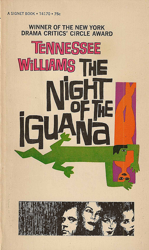
Ernest Hemingway’s With Due Respect became A Moveable Feast; William Faulkner’s Twilight (not a vampire story!) became The Sound and the Fury; Tennessee Williams’ Blanche’s Chair in the Moon (not a bad title in itself) became A Streetcar Named Desire; D. H. Lawrence’s Tenderness became Lady Chatterley’s Lover; George Orwell’s The Last Man in Europe became 1984; Carson McCullers’ The Mute became The Heart Is a Lonely Hunter; Alex Haley’s Before This Anger became Roots; Vladimir Nabokov’s The Kingdom by the Sea became Lolita; Herman Melville’s The Whale became Moby Dick; Stephen Crane’s Private Fleming, His Various Battles became The Red Badge of Courage; John Steinbeck’s Something That Happened became Of Mice and Men; Leo Tolstoy’s All’s Well that Ends Well became War and Peace; Robert Louis Stevenson’s The Sea-Cook became Treasure Island; and Harriet Beecher Stowe’s The Man That Was a Thing became Uncle Tom’s Cabin.

This looking-back and revising applies as well to first paragraphs—I’ll develop this subject at greater length in another column—which could be very clear to us at the inception of the story and drive it forward, but which, at the end of everything, may no longer be the best possible way to open the narrative, and may even be clunky and unnecessary. We call this “scaffolding,” the way builders put up a temporary exterior shell just to get a project off the ground, then discard it later when the structure can stand on its own and be completed from the inside.

That’s how it goes with titles—you find and use a good working title that your story, poem, or essay can hang on to while it’s being written, and then you think about whether it’s still good (not just good, but the best) for the work, and decide whether to keep it or to change it. I’ve often found that the best source for titles is the work itself—there has to be a memorable, resonant line or phrase in the work that can carry the whole weight of the piece on its shoulders.

Right now, for example, I’m editing a book of 27 travel essays written by an American friend who’s been fortunate enough to visit some of the most beautiful and spectacular and yet also the most desolate and squalid places on the planet, from Timbuktu and Andalusia to Bhutan and Namibia; she’s fortunate, because it costs a lot of money to get around the world this way, but more than money, it takes insight and compassion to become more than another snapshot-happy tourist mingling with the natives. To acknowledge that privilege—now a double-edged word—up front, I suggested a title phrase that my friend used in one of her essays, and the book will come out later this year in the US under the title Privileged Witness.

While we’re on the subject, how about titling works of art like paintings? It’s a whole other challenge, because the artist—typically more of a visual than verbal person—is expected to find words for an image or an idea that should be able to stand on its own. But how do you refer to a painting or a sculpture without a title? (I’ve always thought of the practice of some artists to use, say, Untitled XXIV as a not-even-clever copout.) We don’t know if Leonardo da Vinci himself gave the title La Gioconda to his famous painting which later came to be known as the Mona Lisa, but that ‘s how Leonardo’s assistant Salai recorded the painting, which he inherited (“Mona Lisa” itself is a shortening of “ma donna Lisa,” my lady Lisa, referring to Lisa del Giacondo, the presumed subject).

For our amusement more than anything, Mark Hudelson, a professor of Art History in Palomar College, came up with his own list of the art world’s most remarkable titles—and you’d have to look up the art works themselves to see how the visuals match the words:

1. I Love You with My Ford (James Rosenquist, 1961)

2. The Raft of the Medusa (Theodore Gericault, 1819)

3. Clear Flippers, Release Fire Gods (James Bell, 1984)

4. The Treachery of Images (This Is Not a Pipe) (Rene Magritte, 1929)

5. Are You Jealous? (Paul Gauguin, 1892)

6. Studio of a Painter: A Real Allegory Summarizing My Seven Years of Life as an Artist (Gustave Courbet, 1855)

7. Dream Caused by the Flight of a Bee Around a Pomegranate, a Second Before Waking Up (Salvador Dali, 1944–see the pic above)

8. High Voltage Sphincter-Winking Livewire Laxative (Robert Williams, 1990)

9. In Advance of the Broken Arm (Marcel Duchamp, 1915)

10. Through the Night Softly (Chris Burden, 1973)

I did say last week that I was going to deal with movie titles as well—an arena of atrocities some of which I, the former scriptwriter, feel personally responsible for—but we’re out of space, so I’ll save that delectable topic for another time.

Penman No. 86: The Art of the Title (1)

Penman for Monday, February 17, 2014

IN MY graduate writing workshop the other week, I received two essays from my students, one titled “Fasting and Abstinence” and the other “Portrait of a Matron.” They were very interesting and well-written pieces, with every potential to be outstanding upon revision. Predictably, the first essay dealt with an eating disorder, and the second with the author’s mother. This prompted me to observe that other revisions aside, these pieces deserved better titles, because their present ones left nothing to the imagination, and worked like big red arrows pointing directly to their respective subjects.

As it happened, I’d already been thinking about writing a short column-piece on the art of the title for some time. As an author, editor, teacher, and reader of books, I deal with titles every working day, and while many if not most of them can be as nondescript and forgettable as the faces of people you meet on the street, a few will distinctly stand out for one reason or another. Memorable titles can be as showy as a bouffant hairdo in electric pink or as plain and as innocent as a five-year-old’s cowlick, but they’ll invariably make you want to take a closer and longer look.

I don’t think that there are any hard-and-fast rules for what makes a good or a bad title; I just know one when I see one, and while tastes will naturally vary, “memorable” can apply to both good and bad. Also, let’s make it clear and not forget that a great title won’t save a bad book, or turn a mediocre piece into a classic (what I’d call “a small shop with a big sign”); conversely, many great books have gotten by with the plainest titles (nothing plainer than The Bible, “the book” itself). Can a short story title be any shorter than John Updike’s “A&P”?

Some titles can simply be too strange; had F. Scott Fitzgerald stuck with one of his first options for titling his new book in 1925, it’s highly doubtful that even Leonardo di Caprio and Baz Luhrmann could have done much to sell a movie version titled Trimalchio in West Egg or another possibility that Fitzgerald considered, The Gold-Hatted Gatsby.

But to be helpful to my students, I told them what I thought a good if not great title should be and should do, and it’s this: it should hint at what the work will be dealing with, but not spell out everything. In other words, it should be oblique, with a touch of mystery, just enough to pique the reader’s interest. This is much more crucial in fiction, which thrives on ambiguity, than in nonfiction, where a certain degree of clarity is to be expected. “The Joys and Pains of Puppy Love” could be suitably efficient for a juvenile nonfiction piece devoted to just that topic; but the only way you could get away with that in a short story would be to assume a seriocomic pose and to deliver far more than what the title might suggest (for that kind of treatment, check out Updike’s 1960 story “You’ll Never Know, Dear, How Much I Love You”).

In no particular order, let me just intone, as in a hypnotic chant, some titles of stories, novels, and plays that have impressed and stayed with me over the years (by editorial convention, titles of books, novels, and plays are italicized; story and poem titles are enclosed in parentheses): Love in the Time of Cholera and One Hundred Years of Solitude by Gabriel Garcia Marquez; “In Dreams Begin Responsibilities” by Delmore Schwarz; “For Esmé, with Love and Squalor” and “Pretty Mouth and Green My Eyes” by J. D. Salinger; The Unbearable Lightness of Being by Milan Kundera; The Importance of Being Earnest by Oscar Wilde; “Of This Time, of That Place” by Lionel Trilling; Midnight’s Children by Salman Rushdie; “Six Feet of the Country” by Nadine Gordimer; Like Water for Chocolate by Laura Esquivel; Interpreter of Maladies and Unaccustomed Earth by Jhumpa Lahiri.

Some authors—the short story writer Flannery O’Connor, the playwright Tennessee Williams, and the novelist Carson McCullers among them—had the gift of titling, almost invariably coming up with titles that burned themselves into your consciousness. Think of O’Connor’s stories “Everything That Rises Must Converge” (which the earnestly Catholic O’Connor borrowed from Teilhard du Chardin) and “A Good Man Is Hard to Find” (which a female colleague, more earnest than Catholic, transposed into “a hard man is good to find”). Williams wrote A Streetcar Named Desire, Cat on a Hot Tin Roof, Orpheus Descending, Sweet Bird of Youth, and The Night of the Iguana, among other plays. McCullers, brilliant but anguished, produced the novels The Heart Is a Lonely Hunter, Reflections in a Golden Eye, and The Member of the Wedding, as well as the short novel The Ballad of the Sad Café.

You’ll see from these examples that I—and the writers I admire—seem to have a preference for longer, almost ostentatious titles, and I suppose it’s true that, uhm, length matters, generally speaking, adding a splendiferous sonorousness (now that’s a terrible title) to the work. Here in the Philippines, no one has employed longer titles than Gregorio Brillantes, some of whose stories I teach—among them “The Cries of Children on an April Afternoon in the Year 1957” and “Faith, Love, Time, and Dr. Lazaro.” Manuel Arguilla’s 1940 story “How My Brother Leon Brought Home a Wife” now sounds almost quaint, but it works perfectly with the temper of that time; and how could one not be drawn to Aida Rivera Ford’s “The Chieftest Mourner” and “Love in the Cornhusks,” classic stories both about Filipino families?

Perhaps surprisingly, despite my expressed preference for the long title, my own works have been rather sparingly titled, with a few exceptions, such as my first novel Killing Time in a Warm Place; the title-stories of my three collections—“Oldtimer,” “Sarcophagus,” and “Penmanship”—have just one word each. I know that you might be seen to be trying to be too cute or too enigmatic this way, but I suspect that my reticence was formed, early on, by an abject lesson from master to neophyte on the perils of overblown prose.

The master was none other than Greg Brillantes, who in the 1970s edited a highly regarded literary journal called the Manila Review, where I—the precocious 20-something newbie with far more ambition than talent—yearned to be published. I sent him a story about a seaside flirtation between a village maiden and a fisherman (a cheap echo of Arguilla, it seems to me now), which I grandiloquently titled “Hour of Defilement”; a few weeks later, my self-addressed, stamped envelope returned to me, with a note from Greg that he had accepted the story, but had decided to change the “sophomoric” (a word I probably had to look up then) title to the less conspicuous “Nights by the Sea.”

That wasn’t the end of my titling aspirations. A few months later, I became enamored of a title that kept running through my head—“Spinsters’ Evenings and Bachelors’ Nights”—and swore to write a story to fit the bill. I did, and sent the piece off again to Mr. Brillantes, who wrote back, in so many words: “I’ve just received and glanced at your new story, and I haven’t finished it yet, but a story with that title can’t be half-bad, so I’m taking it….” My day was made, but I didn’t push my luck, and went on to write stories with titles like “Heartland,” “Cameo,” and “Voyager,” obsessing less with the title than with the opening paragraph, which I was banking on to draw the reader in. But that’s another story.

Next week, I’ll talk about working titles (and changing your mind), and putting titles to artworks and movies.

Penman No. 85: The Mac@30

MBAPenman for Monday, February 10, 2014

ONLY DIEHARD geeks and the tech and business media would have noted the event’s passing, but late last month, the Apple Macintosh computer marked its 30th anniversary. January 24, 1984 was the date when Apple introduced the Macintosh in what became an iconic commercial aired at the Super Bowl—directed by no less than Ridley Scott, who had already done the cult classics Alien and Blade Runner. In that video (which you can still see on YouTube), a female runner carrying a hammer smashes a screen on which an Orwellian dictator has been haranguing a hypnotized audience, breaking the spell. The clear implication, of course, was that a new hero had arrived, prepared to challenge and to crush the hegemony of industry leaders like Microsoft.

Today, three decades later, Apple has become the hegemon in many domains of computing, even outstripped in some respects by upstarts such as Samsung and Google’s Android platform. It’s sitting on one of the world’s largest stashes of cold cash—almost $150 billion, larger than the GDP of two-thirds of the world’s countries. The challenger has become the challenged; and with the loss and absence of its founder Steve Jobs, Apple under Tim Cook has had to deal with the “vision question”: what’s next for the company that built its fortune and reputation as the world’s most innovative? After the iPhone, what will Cupertino’s wizards come up with to create loops of frenzied buyers around city blocks, waiting for the Apple Store’s doors to open? In an age when most consumers have a choice between buying and using a tablet and a smartphone for everyday computing and communication, is there still room for a desktop or even laptop with an old-fashioned keyboard?

Apple thinks so. Interviewing Apple’s new bosses recently, Macworld editor Jason Snell reported: “What’s clear when you talk to Apple’s executives is that the company believes that people don’t have to choose between a laptop, a tablet, and a smartphone. Instead, Apple believes that every one of its products has particular strengths for particular tasks, and that people should be able to switch among them with ease. This is why the Mac is still relevant, 30 years on—because sometimes a device with a keyboard and a trackpad is the best tool for the job.”

(Okay, here, before anything else, let’s get our terms right: “Apple” is the company; “Macintosh” or “Mac” is the computer that Apple makes, in desktop and laptop versions; “iPhone” is the smartphone, “iPad” is the tablet, “iPod” is the music player; and no, there’s no such creature as the “iTouch”; it’s the “iPod Touch.” “MacOS” is the operating system that runs the Mac; “iOS” is the operating system that runs the iPhone, iPad, and iPod. The MacOS has increasingly begun to look and feel like the iOS, and people have begun talking of an ultimate point of convergence when the two might become one.)

I can certainly testify to the fact that, yes, you can have all of these devices at your disposal (resistance is futile—sooner or later, you’ll have them all, even if you have to beg, steal, or borrow), and yes, you will pick out the best one for the specific job: I use an iMac for surfing, a MacBook Air for all my writing, an iPad for lectures, books, and schoolwork, and an iPhone for calls, messages, and nearly all of the above. (I’ve trained myself to write on an iPhone in a pinch, although I miss the BlackBerry’s tactile keypad.)

This, of course, is nothing short of digital indulgence and downright excess, something our fathers and mothers never experienced (although my non-emailing mother has become a gaming freak on her iPhone, and uses it regularly to speak to her brood here and abroad via FaceTime). Ours is the generation caught between the analog past and the digital future; and while that future will surely be more technologically dazzling and perplexing than we can imagine, we want and will get as much of it as we can now, because we can’t afford to wait. The computer is the baby boomer’s ultimate toy, and I’ve often explained my obsession with new digital gadgets (the flipside of my analog obsession with old fountain pens) as my way of cheating time.

Macs and I go a long way back. Thirty years is exactly half my life, and for most of that half-life—since 1986, when I met, touched, and used my first Mac as a graduate student at the University of Michigan, where they had a laser-printing Mac available 24/7 for every 10 of their 40,000 students—I’ve been an unabashed Apple fanboy. There were also some PCs on campus—and I’d eventually buy one, my first computer running on DOS 3.0 with a humongous 10-megabyte hard disk, because it was the only thing I could afford. But it was really the Mac I lusted after, for all the reasons Steve Jobs predicted people would flock to it—it was intuitive (I had brought my Olympia portable with me to the States, and had to be persuaded to give the Mac a chance), it was fun, and it was beautiful.

It wasn’t until I came home, in the early ‘90s, that I got my first Mac—a PowerBook 520c, beloved of Scully and Mulder in The X-Files—which was a gift from a benefactor, who at that moment might as well have been The Almighty. I haven’t looked back since, amassing a virtual museum of Macs, especially portables, from the PowerBook 100 to the MBA. I was glad to learn that, as few as we were like the early Christians, we were not alone. To be an Apple user then was to be a stubborn, persnickety, secretly happy but sometimes publicly sullen member of a distinct minority, derided by the Windows 95 herd (“Windows 95? Why, that’s just Apple 87,” we riposted.)

In the mid-1990s, I joined and later chaired the Philippine Macintosh Users Group or PhilMUG, a handful of Mac addicts—themselves descended from the Macky Mouse Club, an even earlier organization of Apple enthusiasts—who met for monthly get-togethers at Angelino’s on Pasay Road and then Nanbantei near Jupiter Street in Makati. I was part of the focus group Apple assembled for the local rollout of the original iMac, and seeing it in its full glory for the first time was like meeting the Ark of the Covenant. (And to push this semi-blasphemous analogy along, what could have been more mindblowing than meeting the Mac’s messiah himself, Steve Jobs, at MacWorld in San Francisco in 2006, albeit from about 20 feet away? That trip to MacWorld and to Apple headquarters was my visit to the digital Vatican and Holy Land combined.)

Cupertino

Today, PhilMUG has become one of the world’s most active and longest-running Apple User Groups and forums (www.philmug.ph), and I’ve become something of a village elder there, helping chairman Johannes Sia and the other moderators advise newbies on everything from upgrading their machines to choosing the best travel, fitness, and entertainment apps. Everyone, it seems, has an Apple device of one kind or other, or wants to have one. Apple is in commercial heaven, but we—its angels and avatars—aren’t necessarily OK and happy with everything Apple does. Apple’s staunchest supporters can also be its stiffest critics—and we should be, knowing the machines and having invested in them more than anybody else.

But as loudly as I might complain about the iPad’s inability to natively play Flash presentations, among other gripes, I’m resigned to the fact that when the next big Apple product comes around—maybe the iWatch (the precursor of which is the Pebble watch I got for myself and Beng for our 40th anniversary, along the corny theme of “more time together”)—I’ll be there in the front of the queue, asserting my senior citizen’s priority.

As for the Mac itself, I’m also fairly certain that no mobile device, however nifty, will replace a real keyboard and a big screen. At the end of this writer’s working day, a computer is still a glorified typewriter, and it just so happens that as digital Underwoods and Smith-Coronas go, there’s nothing better than a Macintosh. 


Penman No. 84: Pens & Inks

Penman for Monday, February 3, 2014

A YEAR ago, I wrote a piece for this column titled “The (ink and) paper chase,” where I talked about how obsessed some people get with finding just the right paper to write on, fussing over paper color, texture, thickness, and (important to us fountain pen users) feathering and bleed-through.

The last two factors have to do with how tightly the paper’s fibers are packed; the looser they are, the easier it is for ink to spread and scatter through the paper—not a good thing if you’re trying to write a legible letter. This is why ballpoints and cheap paper make better partners—and a good thing, too, that they do, because most people have neither the time, the inclination, nor the loose change to play around with fancy pens and papers, let alone exotic inks.

But what if you did?

In that column last year, I promised I would write a bit more about inks—the essential, indispensable companions of pens—but I never got around to doing it, at least until now.

Inks are the last thing people think about these days in connection with writing, except perhaps in respect of color, which invariably comes down to a choice among black (business formal), blue (a little more personal), and red (for marking something as “wrong!”). In my late father’s time—he worked as a clerk for a government office, so he used fountain pens regularly—you had the option of using blue-black, very likely as Parker Quink or Sheaffer Skrip, and it’s a color I came to associate with my dad, which is why I keep blue-black as a staple for one of my pens.

The fact is—before fountain pens underwent a kind of renaissance in the 1990s more as a fashion statement than as a clunky writing instrument, followed by a plethora of designer inks—there was a wealth of inks available to the discerning public. You could get them in green, purple, brown, pink, orange, and so on, in brands long vanished such as Carter’s, Sanford, and Stephens’, aside from the in-house inks of the major pen makers such as Parker, Sheaffer, Waterman, Montblanc, and Pelikan. There was also a lively competition among these makers in terms of packaging, specifically in labels and bottles (Carter made exceptionally pretty labels), and the bottles have now become highly collectible on their own, some with their vintage contents intact and still usable after 40 to 50 years.

But we’re getting ahead of ourselves. How did ink get its start, anyway? At the advent of writing, ink was made from soot or lamp black mixed with gum (says my trusty guide, The Fountain Pen: A Collector’s Companion by Alexander Crum Ewing); red ink was made from vermillion. In medieval times, the quill pen called for a more fluid ink, and this came from tannins culled from vegetables, converted to gallic acid, then mixed with ferrous sulfate (get that?), resulting in a blue-black iron-gall ink, which you can still procure these days. With the steel-nibbed pen (which acid corroded) came inks made with chemical dyes, which also led to an explosion of color.

“The range of ink available by the 1920s would bewilder many people today,” noted Ewing. “It is estimated that the German firm Pelikan alone produced 172 different types, colors, or bottles of ink. There were inks for writing, for drawing, for accountants (which could not be erased), for hoteliers (which could be erased) and so on.”

Which leads me to my first admonition about inks, lest I forget: never put India ink (like Higgins) into a fountain pen; it’s meant for calligraphic and technical pens, and will surely clog your fountain pen’s feed (the part of the pen beneath the nib that conveys the ink), possibly requiring repair. Use only ink clearly meant and often marked “For fountain pens.”

I used to say that I was a pen, not an ink person, in that for the longest time, I limited myself to four basic colors: black, blue, blue-black, and brown. I’m nowhere near becoming an ink fiend—some people collect basically just the inks and couldn’t care less about the pens—but over the past year, I’ve found my desk getting more crowded and cluttered by an invasion of ink bottles, in such sacrilegious colors as Diamine Oxblood and Rohrer & Klingner Alt-Goldgrun (more on these esoteric varieties later). In the ink department, I’m a novice compared to many of my confreres at the Fountain Pen Network-Philippines (at least one of whom, Los Baños-based Clem Dionglay, runs a globally recognized blog on inks, papers, and pens). Ask a newbie question like “What’s a nice bright blue ink?” and you’ll get a dozen responses within minutes (on fpn-p.org), answers such as “Pelikan Edelstein Topaz!” or “J. Herbin Bleu Pervenche!” or “Noodler’s Baystate Blue!”

Ah, Baystate Blue…. Many pen folk swear by it, but I’ve never used it myself, for a couple of reasons: I hate bright blue, and BSB (as it’s called, like LSD or MSG) has been notoriously known for staining if not eating into some pens, like vile acid. Some people love flirting with danger, anyway, in the quest of the perfect color.

That quest, of course, is what keeps the ink companies alive—companies that might as well be manufacturing precious wines and perfumes: Noodler’s, J. Herbin, Iroshizuku, Diamine, Private Reserve, Rohrer & Klingner, De Atramentis, and so on. These are no longer your basic Quink and Sheaffer inks that you can buy (and why not?) at National Bookstore. They’re specialty inks, selling on the average for something like P15 per milliliter, or P450 for a 30ml bottle. (To see a mindboggling assortment of these inks, check out a site like www.gouletpens.com, from where we order our supplies if we can’t get them from NBS or the pioneering Scribe Writing Essentials at Eastwood and Shangri-La malls.)

You won’t believe how exotic and even strange some of these inks are. Mahatma Gandhi would squirm if he learned that a 60ml bottle of his namesake ink—produced by Montblanc, in vivid saffron, of course—sells for $100 on eBay. There are inks with extravagant names such as Noodler’s Black Swan in Australian Roses (a lovely deep pink); Noodler’s even has an ink called Whiteness of the Whale, touted to be “invisible during the day, glows under black light.” Some inks are embedded with gold or silver flakes. De Atramentis makes inks that carry scents like apple blossom, or are actually made from wines like chianti and merlot.

And like fine wines and rare vintages, vintage and rare inks now command an audience and a premium. A few weeks ago, educated by online reading, I felt ecstatic to have located and landed two bottles of the now-rare, 1950s Sheaffer Skrip in Persian Rose on eBay for about $10; it’s a flaming pink ink, which makes it highly doubtful that I’ll ever write with it, but just ask the owner of that $300,000 bottle of Chateau Cheval Blanc 1947 when he’s going to take a sip.

Fountain pens come with all different nibs, nib qualities, and filling systems, making ink choice both a pleasure and a pain for the penman (and penwoman). Snooty collectors prefer piston fillers like most Montblancs and Pelikans, but these pistons require patient flushing to get all the old ink and its color out before switching to something new. This is why I generally prefer everyday converters, which make flushing and ink replacement a breeze. To make things even easier, I’ve matched my favorite pens with my favorite inks, going mainly by color—a black pen gets black ink—so I don’t have to guess, when I pick up a pen or two to bring along for the day, what’s in it. And just for the heck of it, I took a shot of these happy combinations, which I’m illustrating this column-piece with.

And I can’t blame you if, after reading this frothy talk about pretty pricey pigments, all you want to say is “Hand me that cheap blue Bic!” 

(The inks and pens in the topmost pic are, downwards: Pelikan Blue-Black in the Montblanc Agatha Christie; Diamine Oxblood in the Parker Vacumatic Oversize; Rohrer & Klingner Sepia in the MB Oscar Wilde; Montblanc Carlo Collodi in the Conway Stewart Marlborough; R & K Alt-Goldgrun in the Onoto Magna; Pelikan Brilliant Brown in the Faber-Castell Pernambuco; and Aurora Black in the MB 100th Anniversary.)