Penman No. 93: Resurrecting Another Lost Master

143Penman for Monday, April 21, 2014

ON THIS Easter Monday, a kind of resurrection story seems to be in order. A few months ago, I wrote a piece about the late painter Constancio Bernardo, a lost master and pioneer of Philippine modernism whose life’s work was then about to be celebrated with a centennial retrospective at the Ayala Museum. Little did I know that—a few weeks later, and thanks to a chance encounter at a literary festival—I would learn of yet another and largely forgotten hero of early 20th century Philippine art.

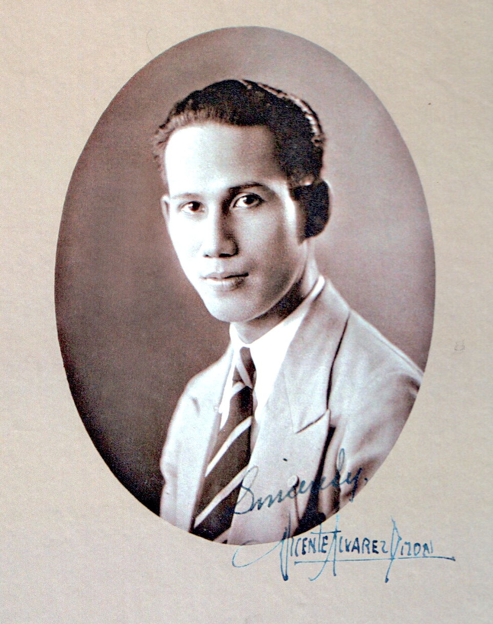
The venue was the Taboan Writers Festival, which we held this year in Subic, with closing ceremonies in Clark Field. It was at Clark that I met Josie Dizon Henson—a painter, writer, and community leader who gifted me with a pair of books she had written. One was a study on Kapampangan orthography, of more scholarly interest; the other book, which caught my fancy, was a slim but substantial, privately published volume titled After the Day’s Toil: A Golden Moment in Philippine Art, a biography of her late father, Vicente Alvarez Dizon and an account of his long-lost masterpiece.

Even at first mention, the name rang a bell in my mind. Two years ago, while doing research for a biography of the late nationalist thinker Emmanuel Q. Yap, I had met (at least by email) a painter named Daniel Dizon, one of Manoling Yap’s boyhood friends. Reminiscing on his friendship with the Yaps, Dan Dizon happened to mention the fact that his father had himself been an accomplished artist—so accomplished that he had won over Salvador Dali in an international competition in the US before the war. That amazing feat—and its doer, Vicente Alvarez Dizon—stuck in my memory. More on that Dali story later.

I had never heard of Vicente Alvarez Dizon before, and as it happened, I would not hear of him again until I met his daughter (and Dan’s younger sister) Josie in Clark. Hearing her name, I made the connection to Dan and to her father, and she seemed delighted to learn that I knew something about her father, and brought me a copy of her book. I set the book aside for a more leisurely read, and when that opportunity arose recently, I found myself engrossed by its account of another extraordinary Filipino life.

Born in Malate, Manila in 1905, Vicente graduated with a diploma from the School of Fine Arts with high honors in 1928. His talent got him a scholarship to Yale in 1934, a sojourn from which he emerged not only with his BFA but also with diplomas in Advanced Painting, Museum Administration and Art Appreciation. Back in Manila, he taught at UP, Mapua, and the National Teachers College; for the rest of his brief life, Dizon would become a staunch advocate of art education and art scholarship, tirelessly lecturing on art subjects around the country.

But his finest hour—the “golden moment” Josie’s book refers to in its title—was likely the Golden Gate International Exposition in San Francisco in 1939, an ambitious, visually opulent panorama that rivaled the New York World’s Fair that opened the same year on the opposite coast of America.

Within the exposition, International Business Machines, already an industry giant under its founder Thomas Watson, decided to sponsor an international art exhibition and competition featuring artists from 79 countries where IBM did business, including the Philippines. The Philippine pavilion in San Francisco actually displayed two other works by young Filipino masters, murals by Victorio Edades (assisted by Botong Francisco) and Galo Ocampo. But as fate would have it, it was Dizon’s painting that IBM chose to represent the Philippines.

142
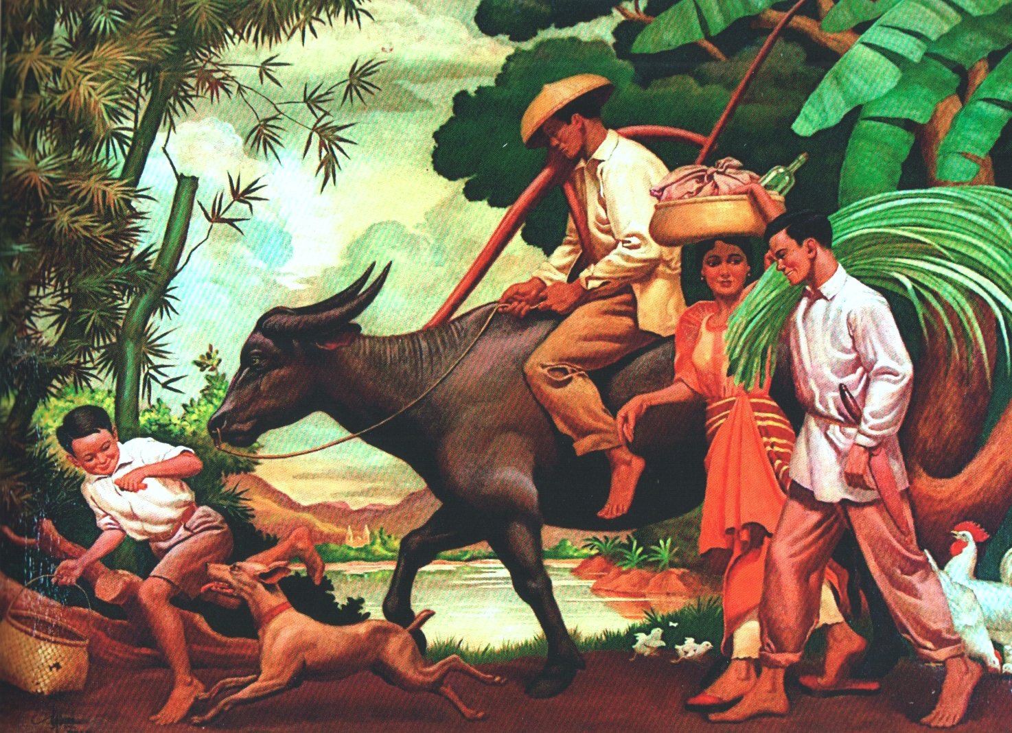
The painting had been Vicente’s thesis project at Yale. Typical of its time in its evocation of a rustic, romantic countryside, the painting depicted a Filipino family—father, mother, son, carabao, and other farm animals—heading for home at the end of another working day. Because he worked on it at Yale, he had to use Caucasian models for his studies, but replaced the faces with their native counterparts in the final work. He apparently took it home upon graduation, because it was in Manila where IBM’s Philippine representative, Kevin Mallen, saw and bought the painting for IBM, which shipped it to America for the competition. When the results were announced, Dizon had won first prize, followed by Spain’s Salvador Dali and by the American Robert Philipps. (Coincidentally, at the other global fair in New York that same year, another Filipino, Fernando Amorsolo, also won first prize for his painting “Afternoon Meal of the Workers.”)

But that’s not where the remarkable story of this remarkable painting and its creator ends. Vicente himself, sadly, would die young and penniless in 1947 at just 42, afflicted with tuberculosis, a condition that, according to Dan, also ravaged the family’s finances. His masterpiece and legacy lived on—although it was almost lost.

In October 1980, the Batangas-born Filipino-American physician, Roger Pine, received a letter at his home in Princeton, New Jersey from a New York art dealer informing him of the availability of a painting with a Filipino theme titled “After the Day’s Toil,” 40 x 53 inches, signed “V. A. Dizon, 1936.” Would he be interested in looking at and possibly acquiring it? The dealer sent a transparency of the painting along.

The painting had last been seen by the Dizons in 1952, when it had been shipped from the US to Manila on loan from IBM for a local exhibition. And then it vanished. Further inquiries produced no leads other than the name of a New York gallery, which had no records of it.

When Roger Pine received the invitation from his dealer, he felt an instant connection to the painting, having grown up in a family of farmers. He knew nothing about the painting, the artist, nor its provenance, but he did know, especially after seeing the painting itself in New York, that he just had to have it. The dealer—who said that he had earlier tried to interest the National Museum in Manila to no avail—let the Pines have it on installment. It was also only in New York that Roger Pine realized that he had found and bought a long-lost prizewinner.

Next came the trans-continental search for the painter’s family—not an easy task in those pre-email, pre-Google days. It eventually took 25 years and a bit of luck—a dinner conversation during one of the Pines’ visits back in Manila—to connect the Pines with the Dizons. In 2006, the two families met, and the following year, two generations of Dizons trooped to Princeton, New Jersey to visit the Pines and to see, once again, Vicente’s painting. It was a tearful but joyful reunion, the kind of happy ending that deserves to be written about in a book. That’s what Josie Dizon Henson has done.

Poster 12x38

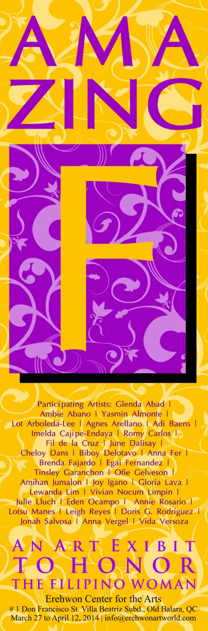
AND WHILE we’re on the subject of documenting Philippine art, let me note that, in celebration of the Filipino woman and of Women’s History Month, the Erehwon Center for the Arts in Quezon City recently hosted “Amazing F,” featuring some of the country’s leading artists, both women and men.

The participating artists included Glenda Abad, Ambie Abano, Yasmin Almonte, Lot Arboleda-Lee, Agnes Arellano, Adi Baens, Imelda Cajipe-Endaya, Romy Carlos, Fil de la Cruz, June Dalisay, Cheloy Dans, Biboy Delotavo, Anna Fer, Brenda Fajardo, Egai Fernandez, Tinsley Garanchon, Ofie Gelvezon, Amihan Jumalon, Joy Igano, Gloria Lava, Lewanda Lim, Vivian Nocum Limpin, Julie Lluch, Eden Ocampo, Annie Rosario, Lotsu Manes, Leigh Reyes, Doris G. Rodriguez, Jonah Salvosa, Anna Vergel, and Vida Verzosa.

Erehwon—located at #1 Don Francisco St, Villa Beatriz Subdivision, Old Balara, Quezon City—is fast becoming one of Metro Manila’s most vibrant art centers, hosting not just painters but also musicians like the Metro Manila Concert Orchestra. The Amazing F show, which ran until last week, was another of its projects to benefit the Erehwon Arts Foundation, which aims to run a residency program for talented but financially challenged young Filipino artists.

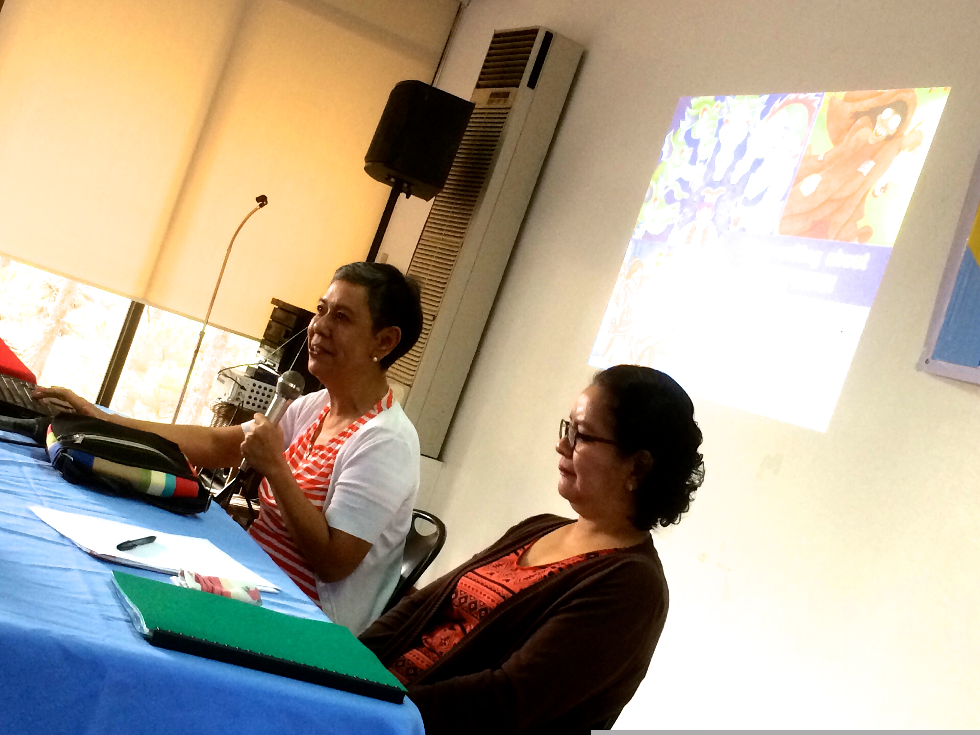
It was curated by Erehwon Arts Foundation Vice President June Poticar Dalisay, who said that “AMAZING F is an art exhibit that explores the different facets of the Filipino woman, a complex and enigmatic individual whose roles are varied and endless, affecting every sphere of our personal and public lives. She is warm, sweet, and compassionate, but she can also be can be cunning, feisty, and combative.” Don’t I know that—and yes, June, I stand amazed!

Penman No. 92: Nurturing Our Sense of Nationhood

IMG_3176Penman for Monday, April 14, 2014

AT THE University of the Philippines Institute of Creative Writing, we were happy to recently welcome into our ranks several new “associates”—UP colleagues who were also accomplished writers whom we felt could make significant contributions to the Institute’s programs. They were Chari Lucero, Luna Sicat-Cleto, Eugene Evasco, and Heidy Eusebio-Abad. Chari is a bilingual—indeed, a multilingual—fictionist and essayist, a very sharp reader of texts; Luna is a playwright and novelist in Filipino; Eugene, a Palanca Hall of Famer, is a writer of stories and poems for children in Filipino; and Heidi writes stories for children in English.

The entry of Eugene and Heidi into the UPICW was particularly timely, since we were severely short-handed as far as our expertise in writing for children and young adults was concerned. Puppetry advocate Amelia Lapeña-Bonifacio remains on our board of advisers, but we had lost Rene Villanueva to an early death and Carla Pacis to La Salle. By bringing Eugene and Heidi into our workshops, we wanted to remind ourselves—and the reading public, of course—of the primal importance of children’s literature as a means of nurturing our sense of nationhood in the imagination of our youngest citizens.

This renewed emphasis was evident at the 53rd UP National Writers Workshop, which we held last week in Baguio. At least three of our 12 workshop fellows were writers for children and young adults. Cyan Abad-Jugo, who already has a PhD in Creative Writing, is working on a book of 13 stories in the fantastic mode. Renato “Nats” Vibiesca, a Palanca award winner, teaches at the Polytechnic University of the Philippines; Marcy Dans-Lee is primarily an illustrator and artist, but also writes her own texts, often drawn from the wealth of indigenous lore that surrounds her in Davao, where she teaches at the University of the Philippines-Mindanao.

Cyan submitted what can most easily be described as modern horror stories; Nats contributed a comic piece about a poor kid who dreams of becoming a bossing, an entrepreneur; Marcy presented retellings of native creation myths. The fact that their material and their approaches vary so widely can only bode well for the future of children’s literature in the Philippines. Herewith, some excerpts from their “poetics”—their explorations into why and how they write what they write (I’ve translated Renato’s excerpt from Filipino):

Cyan Abad-Jugo: I wanted to see if I could achieve “a wider lens on ultimate reality” by making a slight detour “from direct representation of the surface of reality;” I wanted to skew it a little or reshape it a lot, and see if I could not arrive at better relevance and social commentary (which is what I thought Scholes meant by returning “towards actual life by way of ethically controlled fantasy”). This does not mean that I wanted to identify an aspect of social reality and then work it into my fiction. I never start out with such clarity of mind, and cannot give myself clear directions; my default mode is “lost mode,” and so must find my way out of the labyrinth I inevitably find myself in.

The project had more to do with finding out whether the fantastic mode inherently contained within it a metaphor for what it was like to live in our own world. I wanted to write first, as always, and see what came of each story in the end (hello, story, do you have a metaphor in you after all?); but I also wanted to limit what I wrote, I wanted to try my hand at writing particular kinds of tales, given their definitions or what I thought to be their definitions. As I clarified in my proposal:

Though stories never adhere to strict definitions of modes or genres, the definitions and characteristics of each kind of tale or story could serve a heuristic purpose; they could serve as guides to the writer who wants to explore the capabilities, flexibilities, and possibilities of the fantastic story, and how it expresses what we are and could become.

Renato Vibiesca: The short story “Sawsawan sa Padyak” deals with the experience of a boy (with the nickname Kadyot) who grows up in Gagalangin, Tondo—specifically, his transition from childhood to adolescence while confronting his family’s poverty. The story raises questions about the self, physical change, initiation, experimentation, confusion, observations about the adult world, vice, and other instances that address this period of transition. The story also illustrates the culture, the exploits, and the strategies employed by the poor to survive and stay in the city. Even as these problems aren’t solved in their entirety within the story, it does offer hope for the protagonist who keeps on dreaming as he moves along this new path in his life.

The story was written from the point of view of the protagonist, using a voice unique to a 12- or 13-year-old; often facing personal problems, tossing questions around in his mind, nudging forward and backward in his decisions…. Though often full of fear, experience and his station in life become drive him to become more creative and resourceful.

The story’s main aim is to give value to how such young persons face life’s challenges. It isn’t very often that the experiences of adolescents are taken up in fiction. This stage is an eventful one, which makes it more important for readers of this age to be given guidance. The author hopes that more works—both short stories and novels—will be written along this line.

Marcy Dans-Lee:Monsters are my personal inspiration
for writing for children, as children can relate
more to monsters than grown-ups. Children
believe that monsters are real; adults believe that monsters are real only in other adults. And because children believe in monsters, they have the ability to embrace “magic” in stories. As a writer for children, I depict magic with gentle care, never underestimating my little reader’s intelligence for they have been known to persistently demand “Why?” And the writer must be prepared to give them valid and reasonable magic, one that has practical logic, delicately balanced by its own breathtaking mystery.

In writing Luis and the Enchanted Creatures, my intention was to introduce children to six fearsome folkloric Filipino monsters. Under the shade of a balete tree, Luis reads about each monster in his grandmother’s old forbidden
book, from which the monsters soon emerge. In
a child’s mind, because the monsters are in the book, it is logical for them to come out of it. This is acceptable magic for children; it is completely reasonable.

Likewise, the adult’s choice of words in talking and writing is inarguably different from that of a child. Simplicity and straightforward narration are encouraged, while expanding a child’s vocabulary is the writer’s choice. Repeating a new word, a phrase or a sentence allows for remembering and internalizing meaningAs a writer, I particularly enjoy dialogues for these provide me the opportunity of acting
out character parts, drawing inspiration from every child’s unforgettable characters, like the pig’s chinny chin-chin and the wolf ’s huff and puff, as well as the nightly read-aloud sessions to become an incredibly angry Papa Bear, a delicately shocked Mama Bear and a whining spoiled Baby Bear when they see their bowls of half-eaten porridge, their chairs mussed up, and their bed sheets crumpled and undone.

The style of putting these words together however may lead a writer to unknowingly
“talk down” to children. Writers for children
are particularly vulnerable to this danger for as adults, we are sadly accustomed to innovating the strangest, most convoluted ways of controlling and negotiating with children in order to restrain their innate curiosity. We tend to be condescending, unaware that we are in fact the primary bullies
in their young lives. When I draft a story, I unconsciously converse with a child—with the same respect I converse with adults.

Simultaneously, my mind’s eye can see the illustrations that will go with the story. This anticipation allows me the luxury of fewer words since the illustrations will speak a thousand words. For after all, does a writer for children need to explain that a monster has a thin face, with big scary eyes, sharp yellow teeth and long unruly hair? Such descriptions are certainly better drawn than written.

In the end, “happily ever after” means that our stories and illustrations for children
must contribute to inspire a child’s imagination
to become real in adult life. For how else can technology, medicine, green urban planning, space and time travel be imagined and made real, if not for stories of monsters and magic?

(That’s Marcy and Heidi in the pic.)

Penman No. 90: The Monkey Wrench

Penman for Monday, March 24, 2014

ANOTHER INTERESTING work came into my Creative Nonfiction class last week (yes, folks, there is such a large and lumbering creature as CNF for me, and if there are people who think otherwise, then that’s their problem, not mine nor my students’): a piece of reportage on the natural beauty of Los Baños and Mt. Makiling. It opened with an introduction to the jade vine, a beautiful plant that’s apparently not that easy to find.

My student, the author, came across one on the mountain after several hours’ hiking. He noted that “The showiest parts of the plant, which it is especially prized for throughout the world by horticulturists and exotic plants collectors alike, are its inflorescences which comprise translucent jade or blue-green flowers. Collectively, these rare colored flowers would hang like a bunch of jade pendants or a chandelier, effortlessly decorating the forest canopy during flowering season which comes around April.”

The work then moves on to a discussion of and an argument for biodiversity, citing an expert’s opinion that “although there have been successes as in the case of the Tubbataha Reef in Palawan and the Mt. Iglit-Baco National Park in Mindoro Occidental which has been the home of the endangered tamaraw, there is enormous room for improvement in the conservation and protection of other key places such as the Peñablanca protected area in Cagayan, the Agusan Marsh in Agusan del Sur, and even Mt. Makiling, which is one of the few places in the country where the jade vine naturally flourishes.” The piece concludes with a look into new propagation techniques being explored for the jade vine, and into its market potential.

All told, the piece was very capably done, save for the usual edits and the suggestion of a better choice of words here and there. In this and in a previous submission, its young author showed skill and sensitivity, as well as an abiding love of nature, having studied in UP Los Baños and having lived there for many years.

Now here’s the thing: in my class, “good” can’t ever be good enough. My students have my mantras coming out of their ears: “Raise the stakes!” and “Push the envelope!” Critics of writing programs who keep carping that all these programs and workshops ever do is promote safe, boring, homogenized pieces should take a seat in my class. I’m far from the world’s best writing teacher, but I certainly don’t give my students an easy time, any more than I give myself an easy time. I try to give every piece, no matter how poorly conceived or executed, the attention it deserves, assuming that it’s all the student could do up to that point; if I could help him or her turn into something that at least makes sense and hangs together, something he or she could share proudly and happily with others, then I would have done my job.

But I tend to be hardest on my best students—some of whom will come to class wth an attitude, and some of whom don’t even realize just how good they are—because the hardest and yet also the most worthwhile transition to make is that between being merely good and being possibly great.

This is why I keep urging them to raise the stakes and to push the envelope, because great writing—by which I mean something substantial and memorable, in both substance and form—is far more than a matter of perfect grammar or witty language. I’d much rather have a rough-hewn but editable story heavy with human drama than a clean but tepid script with every detail correctly rendered but showing me little more than what I’ve already seen before or what I could have predicted myself. I want a kink in the character, a twist in the plot that the author’s understanding of human action will not only make plausible but even dramatically inevitable.

In the case of our “jade vine” piece, we took one big step backward and tried to assess its possibilities. What was its real or best potential subject? What was the author capable of? Sure, it was interesting to know all those details about the jade vine, and of course we all agreed that protecting our biodiversity was a good and necessary thing—but these were all safe points to make, a plea for the preservation of natural beauty that no one in his or her right mind could contest.

This was where I trotted out another of my writing mantras: “Let’s throw a monkey wrench into the works!” By “monkey wrench,” I meant an incongruous element, something that might even go against the grain of the piece, but also something that would give it more complexity and traction. I’ve sometimes found myself doing this with my own stories, usually as a check against sentimentality and predictability. In a story titled “Some Families, Very Large,” a Christmas story about a boy and his errant father, I took the story to a funeral parlor toward the end, just because it was the most un-Christmasy thing I could think of.

You don’t really plan these things from the beginning (which would make them, in a way, predictable); instead, just when everything seems to be going right, you pause and ask yourself—almost with narrative mischief in mind—“Now, what if….” What if an ambulance takes a wrong turn on its way to a pick up a patient? What if, on a trip celebrating their reconciliation, an estranged couple is waylaid by bandits and forced to reveal secrets better left untouched? What if, in a nonfiction piece making an eloquent case for biodiversity and beauty, we throw in an element of violence?

That’s right, violence—which, to be totally unromantic and untouristy about Los Baños and Mt. Makiling—has sadly scarred that otherwise edenic landscape. I reminded the author—who probably knew the circumstances better than I did—of the recent spate of horrifying crimes and incidents that had shaken up that area and UP’s campus there: the rape and killing of a coed, the drowning of two UPLB students in a stream, the fatal stabbing of a woman by her husband, a security officer who then committed suicide. These were morbid facts that, in my former life as the UP System’s top PR man, I might have de-emphasized or treated in another way; but the nonfictionist’s eye has to be bare, wide open, and utterly dry, and I asked my student to maintain that stance as well.

What did murder and mayhem have to do with jade vines and biodiversity? There’s the real challenge to the creative nonfictionist—not just the good, competent one, but the potentally great one. I suspect that writers the likes of Nick Joaquin, Greg Brillantes, Kerima Polotan, and Pete Lacaba would instinctively have known how to mesh these disparate elements together into a gripping, compelling narrative that would have seamlessly paralleled violence of one kind with another. Rather than being perfectly smooth, their pieces would have, here and there, retained a rough edge—and showed off the glint that comes with rough edges.

And that, not incidentally, is the advantage of creative nonfiction over everyday journalistic reportage or the conventional essay: it can marshall different and even discordant notes and voices together, and, unlike essays which demand clarity of thought and meaning, employ and even thrive on ambiguity. One of the CNF models I use in class is a New Yorker piece titled “The Fourth State of Matter” by Jo Ann Beard, which begins with an image of the Milky Way in the night sky, a sick dog, squirrels, and an absent husband—before veering off into the 1991 shooting of four people by a Chinese graduate student at the University of Iowa, ending with “Shards of fly wings, suspended in amber.” Messy and marvelous.

The next time you’re feeling safe, smug, or soft about your work in progress, toss that monkey wrench into the middle of the piece, and see what happens. If you didn’t see it coming, then it isn’t likely that others would have, either, and in the very least, you’d have a fresher and more provocative work in hand.

(Picture of the jade vine from lifestylebygoldie.com)

Penman No. 89: Camels and Scribes

d4966305xPenman for Monday, March 17, 2014

A FEW months ago, I wrote about the fountain pens that famous people like T. S. Eliot, Winston Churchill, and Neil Gaiman used, and especially about how Eliot’s pen had been donated by his widow Valerie to the Royal Society of Literature for members to sign themselves with into the society’s logbook. The more practical-minded will and should, of course, dismiss any such discussions of celebrity memorabilia as mere fetishism, an adoration of idle and otherwise meaningless objects.

Happily, that’s a charge I can live with, as an incorrigible collector of lovable old junk, particularly pens to which I’m drawn by some deep Freudian current I won’t even try to palpate. I never even excuse the fact that I collect pens not so much to write as to doodle with—I enjoy laying wet bright lines on a crisp sheet of paper and watching the ink spread and shade. Whatever words I may be forming really mean little; it’s the sheer pleasure of forming the words that matters for the moment, the joy of the first pictographer tracing the outline of a bull on a cave wall, of the medieval scribe illuminating the Book of Genesis.

Eliot and Co. weren’t collecting Watermans and Conway Stewarts, of course; they were putting them to work. In their time, everyone wielded a pen, from insurance executives like Wallace Stevens to ambulance drivers like Ernest Hemingway and Walt Disney. Soldiers carried pens with them to the trenches, using ink pellets they could dilute in water; today these wartime pens and their embedded pellets are highly prized.

I was thinking of just this scene last week when I came across a thread in a pen forum talking about the pen or pens that T. E. Lawrence—Lawrence of Arabia, immortalized by Peter O’Toole in the 1962 film epic—used in his desert campaigns. Lawrence was an indefatigable writer, and his Seven Pillars of Wisdom remains as interesting today as when he published it in 1922.

The forum discussion wasn’t really even about Lawrence’s pen but the ink he used; apparently, he preferred a special French-made ink, one that his pen could safely ingest and expel. India or carbon ink is fine for drawing but is usually too thick for use with conventional fountain pens, whose feeds or ink channels it will clog. A forum member (many thanks to “carlos.q” from Puerto Rico) had dug up a typewritten letter from Lawrence, who was back in Southampton, dated May 3, 1934 and addressed to a friend initialed “FV”. In it, he complains (note his curious abuse of the colon) that “I apologize for the ink. The only carbon ink that will run in a fountain pen is Bourgeois: and that is sold only by Reeve in the bottom of Charing Cross Road. I have emptied my bottle of all but the too-thick dregs: I cannot demand more by post: but as soon as the R.A.F. will pay my expenses to London for a working day I shall go to the shop and buy some, and again charge the excellent pen. Only carbon ink is ink—that I wholly agree. I badly want to reach London again, but cannot afford a private visit.” (It’s sad enough to see this proud man in such dire straits, but sadder still to know that he would be dead in a year, from a motorcycle spill.)

Lawrence’s pen—two of them, actually, a Swan and a Conway Stewart—would turn up in a Christie’s auction in 2007, realizing over $5,000. The pens were accompanied by a 1969 letter from a Lawrence associate establishing their provenance, which noted that they had both been “trodden on by a camel & broken,” although this likely applied only to the Swan, as the Conway Stewart pictured had been made much later than Lawrence’s camel-riding days. The letter does end, presciently: “They may be worth something one day.”

That’s something we all wish we could say for our possessions, hopefully without requiring the chunky foot of a roving dromedary to enhance their narrative value. Having just stepped into the gray zone of seniorhood, I often wonder what will become of my trove of mostly vintage Parkers, Sheaffers, Montblancs, Pelikans and what-not once I sign my last signature. They’ll be worth something, for sure, but all of them put together might not even be enough to trade up for a Rolex, so it isn’t their bankable value I’m thinking about, but the stories they carry, especially the dozen or so in my daily rotation: “This one I got from the Thistle Pen Shop in Edinburgh, and it led to a story that became a book; this one I found in the Greenhills tiangge, selling for a tiny fraction of its actual worth; this one was being sold by a shop in Auckland, but it was missing a tiny part, a tassie which I later found online at the Berliner shop in New York; this one I found in an antique shop on Morato, inscribed to a ‘Consuelo,’ who would have worn it as a pendant on a chain….” And so on.

Last year I told myself that I would try to unload about a third of the collection, thinking to keep just the best dozen or so by the time I turn 70, but turning 60 gave me an excuse to acquire even more ink-spitting baubles. How to say no to a half-priced Montblanc Oscar Wilde, the flamboyant companion to my black-and-formal Agatha Christie? Or the Onoto Magna Classic in mottled tortoiseshell, its golden tongue spinning tales in a summery green-gold (known to ink connoisseurs as Rohrer & Klingner Alt-Goldgrun)? Let me declare this here and now: camels are strictly forbidden from entering my barangay in UP Diliman; any large humpbacked mammal coming within a hundred meters of my house will be shot on sight (with liberal squirts of india ink).

Scribe

Now, if all this talk of bygone pen-mongering strikes a responsive chord in you—evoking the inner Lawrence or the inner Agatha (Christie tracked Lawrence’s footsteps in Syria, intrigued by his spying)—you might want to pay a visit to the newest pen palace in town, a veritable emporium of pens, papers, inks, and even wax seals.

The members of our local (and still growing on its sixth year!) pen club, the Fountain Pen Network-Philippines, were a captive crowd at the recent launch of Scribe’s new flagship store at the East Wing of Shangri-La Plaza Mall. Scribe’s owner, the lovely and gracious Marian Yu-Ong, recalled how the business began in 2002 as an importer of writing and reading products, before opening its first store in Eastwood Mall in 2009. Also featured at the launch were the works of three master calligraphers whom Scribe has designated its ambassadors: hand-lettering maven Fozzy Dayrit, advertising executive Leigh Reyes, and architect-conservator Mico Manalo.

Today, if you want to feast your eyes on the largest and most sumptuous range of quality pens, papers, and inks in Metro Manila, there’s really no other place to go but Scribe Writing Essentials—make that “places,” because aside from Shang and Eastwood, Scribe can also be found at Glorietta 5, SM Aura Premier, and SM Megamall Fashion Hall.

I paid a visit to Scribe’s new flagship store after the launch, and was impressed to find an assortment of quality pens that we used to have to order online or fly to Hong Kong, KL, or Singapore for, and at very competitive prices, brands like Pelikan, Sailor, Platinum, Kaweco, and TWSBI, as well as the more familiar Cross and Lamy.

Here’s my standing advice to fountain-pen newbies, faced with these choices: if you want one good, classic pen you can expect to use for the next ten years, invest in a Pelikan; if you want a good, well-designed pen with a great nib for a price that won’t break the bank, try the Taiwan-made TWSBI (twis-bee), a huge hit among pen aficionados. Then treat yourself to a bottle of J. Herbin ink and a Midori notebook, and before long you’ll be scanning the horizon for wayward camels.

(Upper photo from christies.com)

Penman No. 88: Whatever Happened to the New NAs?

Penman for Monday, March 3, 2014

I GOT a series of messages from a fellow member of the Philippine Macintosh Users Group a few weeks ago, but it had nothing to do with Macs or computers; of all things, it had to do with the actress Nora Aunor and the National Artist Award. I thought it was interesting and compelling enough to take up in this corner, since I’d been wondering about some of the same things myself.

Before I go one line further, let me say that I was a member of a fairly large lower-level committee that was part of the recent selection process for the National Artist Awards. I signed a non-disclosure agreement when I joined that committee, so nothing I say here will be emanating from our discussions in that committee, which will remain confidential.

What’s no longer a secret, since it’s emerged from other sources online, is that a number of people, including Nora Villamayor (aka Nora Aunor), have been recommended for recognition as National Artists. The recommendations of our committee went up to yet another committee or council for final evaluation, before being forwarded to the Office of the President for proclamation, prior to the conferment of the awards themselves.

So far, so good. The prescribed process was rigorously respected and followed by the National Commission for Culture and the Arts, which oversees it (the board of the Cultural Center of the Philippines weighs in, I believe, at the last stage prior to sending the final list off to Malacañang). This was of keen interest to many Filipino artists and the cultural community—not just the names of the prospective NAs, but even more importantly, the process itself—given how the Palace, in the past and most recently in 2009, had cavalierly disregarded the rules and common decency to hand out the award to its favorites.

It’s been half a year, however, since that final list reached the OP—and so far, that’s where it’s been, gathering dust and gathering rumor. The loudest of these rumors has it that Nora’s run-ins with the law—presumably a question of morals—have held up her proclamation, as well as that of the others in her batch, and those before them. (Let’s not forget that, as a result of the infamous dagdag-bawas that happened under GMA, the proclamation of legitimately nominated National Artists such as the late Federico Aguilar Alcuaz and Lazaro Francisco—not to mention that of the eminent musician Ramon Santos, who was unceremoniously dropped to make way for others far less qualified—was indefinitely postponed.) Another bit of speculation has it that the Palace was betting on the late Dolphy, rather than Nora, to make it through the selection process, and that if Dolphy’s not getting it, then neither will Nora.

That will be a very sad and silly thing to do, if there’s any truth to the scuttlebutt. I respect and admire the work of both Nora Aunor and Dolphy, and myself would like to see them both recognized as NAs. I’ve even had the pleasure and the privilege of writing a couple of filmscripts for Nora (among them, “Ina Ka ng Anak Mo”) and of writing a back-cover blurb for Dolphy’s searingly excellent autobiography, released shortly before his death.

But if Dolphy—the comic genius, but also easily the popular and sentimental choice—was indeed excluded for whatever reason from the final list of recommendees this time, penalizing Nora with a similar rejection isn’t going to make things right. Instead, I’d be the first to sign on to a new campaign to endorse Dolphy in the next round of selections. Employing a moral argument is just going to make things worse, by introducing a spurious element into the issue. The religious conservatives won’t like it, but the plain fact is that artistic excellence and personal morality have never made a necessary if a happy marriage; let’s not ask of our finest artists what we don’t and can’t demand of our national heroes.

Early last month, my PhilMUG friend Don Rapadas wrote NCCA Chairman Felipe de Leon, Jr. a letter to inquire about the case, and he gave me his permission to quote from that letter:

“I am Zandro G. Rapadas of the Nora Aunor for National Artist Movement, and it is my privilege to write to you and thank you for the honor you bestowed on Ms. Nora C. Villamayor at the 6th Ani ng Dangal Awards held last Sunday, February 2. It was a well-appreciated and regarded state recognition for the international honors that Ms. Villamayor brought to the country in 2013, particularly for her Best Actress wins at the 7th Asian Film Awards in Hong Kong, and at the 3rd Sakhalin International Film Festival in Russia.

“With all her achievements to date locally and abroad, there is no doubt that Nora C. Villamayor’s time has come to be officially recognized and honored as a National Artist, hence our official nomination of her to the Order of National Artists in November 2012….

“The media and the public have known of the six artists endorsed for confirmation, proclamation, and conferment by Malacañang since early October last year, and we welcomed it with much rejoicing, because a new set of National Artists means the restoration of trust and respect for this state honor, which was unfortunately tarnished with the 2009 controversy involving artists added by Malacañang for proclamation and conferment.

“We believe it was fair enough to make this information known to the public because the decision by the Joint Boards of the CCP and NCCA has already been made and submitted to Malacañang, and what follows should be transparency in the final stage of the process and, on the part of the public, vigilance to help ensure that the transgressions of 2009 will remain a thing of the past. After all, this is a state honor, and the institutions involved operate on public funds, hence the public interest. Moreover, the deciding officials are public officials, and a ‘public office is a public trust.’ Certainly, no one can take us to task for being watchful this time.

“And watchful we have been. We know that after the Honors Committee convened to discuss the endorsement, they went back to your office and requested you to comment on issues raised about morality and past legal cases against Ms. Villamayor, your candidate for National Artist for Film and Broadcast Arts. And we understand that the NCCA has informed Malacañang that it does not take issue with the points raised, and that the Office of the Executive Secretary, who chairs the Honors Committee, has acknowledged receiving this reply early in January this year, and was passed on to the Malacañang Protocol Office for the information of other members of the Honors Committee. Since then and up until last Tuesday, February 4, the latest tracking of its status notes that it’s still with the Protocol Office.

“Why it’s taken this long, we do not know and we do not understand. But what we do know is that out there in the print and social media recently, many are already wondering what’s keeping the Palace from officially proclaiming the new set of National Artists. And included in this anxious waiting are some questions on why the NCCA and CCP have kept mum on the matter. I have attached in this email correspondence a few of these expressions of concern against the long wait.

“On a final note, I wish to underscore that this is not just about our anxious waiting for Nora C. Villamayor’s own cause, but more importantly our desire to see that the original dignity of the National Artist honor is restored with full respect and regard for its original intent and purpose, despite it being subject to political prerogative.”

Don Rapadas’ last point is an important one to note—this is as much about the process as the person. February, our National Arts Month, would have been the perfect time to honor our new National Artists—including the rightful ones from the previous batch; let’s not wait another year to make these long-overdue amends to Philippine culture’s overlooked heroes, and let’s hope Don gets his answer soon. 

(Photo from philstar.com)


Penman No. 87: The Art of the Title (2)

Penman for Monday, February 24, 2014

SOMETIMES WE authors fall in love with titles, especially if they’re ours and they come to us in a dream or in a flash of insight, begging to be written into a story or a poem. This could work, if the inspiration they provide is powerful enough to generate a whole series of thoughts, associations, and narratives that become art. I’ve done a couple of stories myself this way, out of the three dozen or so that I published.

But as I often remind my writing students, every title is a working title until the work is actually finished. That’s when you take a step back and look at what you’ve done, and try to figure out what title might work best for the piece. In other words, the title is most often a matter of hindsight rather than foresight because—especially in fiction—you never really know what you’ve written and what it’s about until you’ve put in that final period. Writing fiction is a process of discovery, not merely the execution of a pre-planned idea.

It’s a good thing, too, that authors decide or can be persuaded to change their minds about titles. I’d like to thank my colleague and student, Thomas David Chaves, for pointing me to a website that listed down a number of these last-minute switches that left us with some of literature’s most familiar titles.

Ernest Hemingway’s With Due Respect became A Moveable Feast; William Faulkner’s Twilight (not a vampire story!) became The Sound and the Fury; Tennessee Williams’ Blanche’s Chair in the Moon (not a bad title in itself) became A Streetcar Named Desire; D. H. Lawrence’s Tenderness became Lady Chatterley’s Lover; George Orwell’s The Last Man in Europe became 1984; Carson McCullers’ The Mute became The Heart Is a Lonely Hunter; Alex Haley’s Before This Anger became Roots; Vladimir Nabokov’s The Kingdom by the Sea became Lolita; Herman Melville’s The Whale became Moby Dick; Stephen Crane’s Private Fleming, His Various Battles became The Red Badge of Courage; John Steinbeck’s Something That Happened became Of Mice and Men; Leo Tolstoy’s All’s Well that Ends Well became War and Peace; Robert Louis Stevenson’s The Sea-Cook became Treasure Island; and Harriet Beecher Stowe’s The Man That Was a Thing became Uncle Tom’s Cabin.

This looking-back and revising applies as well to first paragraphs—I’ll develop this subject at greater length in another column—which could be very clear to us at the inception of the story and drive it forward, but which, at the end of everything, may no longer be the best possible way to open the narrative, and may even be clunky and unnecessary. We call this “scaffolding,” the way builders put up a temporary exterior shell just to get a project off the ground, then discard it later when the structure can stand on its own and be completed from the inside.

That’s how it goes with titles—you find and use a good working title that your story, poem, or essay can hang on to while it’s being written, and then you think about whether it’s still good (not just good, but the best) for the work, and decide whether to keep it or to change it. I’ve often found that the best source for titles is the work itself—there has to be a memorable, resonant line or phrase in the work that can carry the whole weight of the piece on its shoulders.

Right now, for example, I’m editing a book of 27 travel essays written by an American friend who’s been fortunate enough to visit some of the most beautiful and spectacular and yet also the most desolate and squalid places on the planet, from Timbuktu and Andalusia to Bhutan and Namibia; she’s fortunate, because it costs a lot of money to get around the world this way, but more than money, it takes insight and compassion to become more than another snapshot-happy tourist mingling with the natives. To acknowledge that privilege—now a double-edged word—up front, I suggested a title phrase that my friend used in one of her essays, and the book will come out later this year in the US under the title Privileged Witness.

While we’re on the subject, how about titling works of art like paintings? It’s a whole other challenge, because the artist—typically more of a visual than verbal person—is expected to find words for an image or an idea that should be able to stand on its own. But how do you refer to a painting or a sculpture without a title? (I’ve always thought of the practice of some artists to use, say, Untitled XXIV as a not-even-clever copout.) We don’t know if Leonardo da Vinci himself gave the title La Gioconda to his famous painting which later came to be known as the Mona Lisa, but that ‘s how Leonardo’s assistant Salai recorded the painting, which he inherited (“Mona Lisa” itself is a shortening of “ma donna Lisa,” my lady Lisa, referring to Lisa del Giacondo, the presumed subject).

For our amusement more than anything, Mark Hudelson, a professor of Art History in Palomar College, came up with his own list of the art world’s most remarkable titles—and you’d have to look up the art works themselves to see how the visuals match the words:

1. I Love You with My Ford (James Rosenquist, 1961)

2. The Raft of the Medusa (Theodore Gericault, 1819)

3. Clear Flippers, Release Fire Gods (James Bell, 1984)

4. The Treachery of Images (This Is Not a Pipe) (Rene Magritte, 1929)

5. Are You Jealous? (Paul Gauguin, 1892)

6. Studio of a Painter: A Real Allegory Summarizing My Seven Years of Life as an Artist (Gustave Courbet, 1855)

7. Dream Caused by the Flight of a Bee Around a Pomegranate, a Second Before Waking Up (Salvador Dali, 1944–see the pic above)

8. High Voltage Sphincter-Winking Livewire Laxative (Robert Williams, 1990)

9. In Advance of the Broken Arm (Marcel Duchamp, 1915)

10. Through the Night Softly (Chris Burden, 1973)

I did say last week that I was going to deal with movie titles as well—an arena of atrocities some of which I, the former scriptwriter, feel personally responsible for—but we’re out of space, so I’ll save that delectable topic for another time.

Penman No. 86: The Art of the Title (1)

Penman for Monday, February 17, 2014

IN MY graduate writing workshop the other week, I received two essays from my students, one titled “Fasting and Abstinence” and the other “Portrait of a Matron.” They were very interesting and well-written pieces, with every potential to be outstanding upon revision. Predictably, the first essay dealt with an eating disorder, and the second with the author’s mother. This prompted me to observe that other revisions aside, these pieces deserved better titles, because their present ones left nothing to the imagination, and worked like big red arrows pointing directly to their respective subjects.

As it happened, I’d already been thinking about writing a short column-piece on the art of the title for some time. As an author, editor, teacher, and reader of books, I deal with titles every working day, and while many if not most of them can be as nondescript and forgettable as the faces of people you meet on the street, a few will distinctly stand out for one reason or another. Memorable titles can be as showy as a bouffant hairdo in electric pink or as plain and as innocent as a five-year-old’s cowlick, but they’ll invariably make you want to take a closer and longer look.

I don’t think that there are any hard-and-fast rules for what makes a good or a bad title; I just know one when I see one, and while tastes will naturally vary, “memorable” can apply to both good and bad. Also, let’s make it clear and not forget that a great title won’t save a bad book, or turn a mediocre piece into a classic (what I’d call “a small shop with a big sign”); conversely, many great books have gotten by with the plainest titles (nothing plainer than The Bible, “the book” itself). Can a short story title be any shorter than John Updike’s “A&P”?

Some titles can simply be too strange; had F. Scott Fitzgerald stuck with one of his first options for titling his new book in 1925, it’s highly doubtful that even Leonardo di Caprio and Baz Luhrmann could have done much to sell a movie version titled Trimalchio in West Egg or another possibility that Fitzgerald considered, The Gold-Hatted Gatsby.

But to be helpful to my students, I told them what I thought a good if not great title should be and should do, and it’s this: it should hint at what the work will be dealing with, but not spell out everything. In other words, it should be oblique, with a touch of mystery, just enough to pique the reader’s interest. This is much more crucial in fiction, which thrives on ambiguity, than in nonfiction, where a certain degree of clarity is to be expected. “The Joys and Pains of Puppy Love” could be suitably efficient for a juvenile nonfiction piece devoted to just that topic; but the only way you could get away with that in a short story would be to assume a seriocomic pose and to deliver far more than what the title might suggest (for that kind of treatment, check out Updike’s 1960 story “You’ll Never Know, Dear, How Much I Love You”).

In no particular order, let me just intone, as in a hypnotic chant, some titles of stories, novels, and plays that have impressed and stayed with me over the years (by editorial convention, titles of books, novels, and plays are italicized; story and poem titles are enclosed in parentheses): Love in the Time of Cholera and One Hundred Years of Solitude by Gabriel Garcia Marquez; “In Dreams Begin Responsibilities” by Delmore Schwarz; “For Esmé, with Love and Squalor” and “Pretty Mouth and Green My Eyes” by J. D. Salinger; The Unbearable Lightness of Being by Milan Kundera; The Importance of Being Earnest by Oscar Wilde; “Of This Time, of That Place” by Lionel Trilling; Midnight’s Children by Salman Rushdie; “Six Feet of the Country” by Nadine Gordimer; Like Water for Chocolate by Laura Esquivel; Interpreter of Maladies and Unaccustomed Earth by Jhumpa Lahiri.

Some authors—the short story writer Flannery O’Connor, the playwright Tennessee Williams, and the novelist Carson McCullers among them—had the gift of titling, almost invariably coming up with titles that burned themselves into your consciousness. Think of O’Connor’s stories “Everything That Rises Must Converge” (which the earnestly Catholic O’Connor borrowed from Teilhard du Chardin) and “A Good Man Is Hard to Find” (which a female colleague, more earnest than Catholic, transposed into “a hard man is good to find”). Williams wrote A Streetcar Named Desire, Cat on a Hot Tin Roof, Orpheus Descending, Sweet Bird of Youth, and The Night of the Iguana, among other plays. McCullers, brilliant but anguished, produced the novels The Heart Is a Lonely Hunter, Reflections in a Golden Eye, and The Member of the Wedding, as well as the short novel The Ballad of the Sad Café.

You’ll see from these examples that I—and the writers I admire—seem to have a preference for longer, almost ostentatious titles, and I suppose it’s true that, uhm, length matters, generally speaking, adding a splendiferous sonorousness (now that’s a terrible title) to the work. Here in the Philippines, no one has employed longer titles than Gregorio Brillantes, some of whose stories I teach—among them “The Cries of Children on an April Afternoon in the Year 1957” and “Faith, Love, Time, and Dr. Lazaro.” Manuel Arguilla’s 1940 story “How My Brother Leon Brought Home a Wife” now sounds almost quaint, but it works perfectly with the temper of that time; and how could one not be drawn to Aida Rivera Ford’s “The Chieftest Mourner” and “Love in the Cornhusks,” classic stories both about Filipino families?

Perhaps surprisingly, despite my expressed preference for the long title, my own works have been rather sparingly titled, with a few exceptions, such as my first novel Killing Time in a Warm Place; the title-stories of my three collections—“Oldtimer,” “Sarcophagus,” and “Penmanship”—have just one word each. I know that you might be seen to be trying to be too cute or too enigmatic this way, but I suspect that my reticence was formed, early on, by an abject lesson from master to neophyte on the perils of overblown prose.

The master was none other than Greg Brillantes, who in the 1970s edited a highly regarded literary journal called the Manila Review, where I—the precocious 20-something newbie with far more ambition than talent—yearned to be published. I sent him a story about a seaside flirtation between a village maiden and a fisherman (a cheap echo of Arguilla, it seems to me now), which I grandiloquently titled “Hour of Defilement”; a few weeks later, my self-addressed, stamped envelope returned to me, with a note from Greg that he had accepted the story, but had decided to change the “sophomoric” (a word I probably had to look up then) title to the less conspicuous “Nights by the Sea.”

That wasn’t the end of my titling aspirations. A few months later, I became enamored of a title that kept running through my head—“Spinsters’ Evenings and Bachelors’ Nights”—and swore to write a story to fit the bill. I did, and sent the piece off again to Mr. Brillantes, who wrote back, in so many words: “I’ve just received and glanced at your new story, and I haven’t finished it yet, but a story with that title can’t be half-bad, so I’m taking it….” My day was made, but I didn’t push my luck, and went on to write stories with titles like “Heartland,” “Cameo,” and “Voyager,” obsessing less with the title than with the opening paragraph, which I was banking on to draw the reader in. But that’s another story.

Next week, I’ll talk about working titles (and changing your mind), and putting titles to artworks and movies.

Penman No. 84: Pens & Inks

Penman for Monday, February 3, 2014

A YEAR ago, I wrote a piece for this column titled “The (ink and) paper chase,” where I talked about how obsessed some people get with finding just the right paper to write on, fussing over paper color, texture, thickness, and (important to us fountain pen users) feathering and bleed-through.

The last two factors have to do with how tightly the paper’s fibers are packed; the looser they are, the easier it is for ink to spread and scatter through the paper—not a good thing if you’re trying to write a legible letter. This is why ballpoints and cheap paper make better partners—and a good thing, too, that they do, because most people have neither the time, the inclination, nor the loose change to play around with fancy pens and papers, let alone exotic inks.

But what if you did?

In that column last year, I promised I would write a bit more about inks—the essential, indispensable companions of pens—but I never got around to doing it, at least until now.

Inks are the last thing people think about these days in connection with writing, except perhaps in respect of color, which invariably comes down to a choice among black (business formal), blue (a little more personal), and red (for marking something as “wrong!”). In my late father’s time—he worked as a clerk for a government office, so he used fountain pens regularly—you had the option of using blue-black, very likely as Parker Quink or Sheaffer Skrip, and it’s a color I came to associate with my dad, which is why I keep blue-black as a staple for one of my pens.

The fact is—before fountain pens underwent a kind of renaissance in the 1990s more as a fashion statement than as a clunky writing instrument, followed by a plethora of designer inks—there was a wealth of inks available to the discerning public. You could get them in green, purple, brown, pink, orange, and so on, in brands long vanished such as Carter’s, Sanford, and Stephens’, aside from the in-house inks of the major pen makers such as Parker, Sheaffer, Waterman, Montblanc, and Pelikan. There was also a lively competition among these makers in terms of packaging, specifically in labels and bottles (Carter made exceptionally pretty labels), and the bottles have now become highly collectible on their own, some with their vintage contents intact and still usable after 40 to 50 years.

But we’re getting ahead of ourselves. How did ink get its start, anyway? At the advent of writing, ink was made from soot or lamp black mixed with gum (says my trusty guide, The Fountain Pen: A Collector’s Companion by Alexander Crum Ewing); red ink was made from vermillion. In medieval times, the quill pen called for a more fluid ink, and this came from tannins culled from vegetables, converted to gallic acid, then mixed with ferrous sulfate (get that?), resulting in a blue-black iron-gall ink, which you can still procure these days. With the steel-nibbed pen (which acid corroded) came inks made with chemical dyes, which also led to an explosion of color.

“The range of ink available by the 1920s would bewilder many people today,” noted Ewing. “It is estimated that the German firm Pelikan alone produced 172 different types, colors, or bottles of ink. There were inks for writing, for drawing, for accountants (which could not be erased), for hoteliers (which could be erased) and so on.”

Which leads me to my first admonition about inks, lest I forget: never put India ink (like Higgins) into a fountain pen; it’s meant for calligraphic and technical pens, and will surely clog your fountain pen’s feed (the part of the pen beneath the nib that conveys the ink), possibly requiring repair. Use only ink clearly meant and often marked “For fountain pens.”

I used to say that I was a pen, not an ink person, in that for the longest time, I limited myself to four basic colors: black, blue, blue-black, and brown. I’m nowhere near becoming an ink fiend—some people collect basically just the inks and couldn’t care less about the pens—but over the past year, I’ve found my desk getting more crowded and cluttered by an invasion of ink bottles, in such sacrilegious colors as Diamine Oxblood and Rohrer & Klingner Alt-Goldgrun (more on these esoteric varieties later). In the ink department, I’m a novice compared to many of my confreres at the Fountain Pen Network-Philippines (at least one of whom, Los Baños-based Clem Dionglay, runs a globally recognized blog on inks, papers, and pens). Ask a newbie question like “What’s a nice bright blue ink?” and you’ll get a dozen responses within minutes (on fpn-p.org), answers such as “Pelikan Edelstein Topaz!” or “J. Herbin Bleu Pervenche!” or “Noodler’s Baystate Blue!”

Ah, Baystate Blue…. Many pen folk swear by it, but I’ve never used it myself, for a couple of reasons: I hate bright blue, and BSB (as it’s called, like LSD or MSG) has been notoriously known for staining if not eating into some pens, like vile acid. Some people love flirting with danger, anyway, in the quest of the perfect color.

That quest, of course, is what keeps the ink companies alive—companies that might as well be manufacturing precious wines and perfumes: Noodler’s, J. Herbin, Iroshizuku, Diamine, Private Reserve, Rohrer & Klingner, De Atramentis, and so on. These are no longer your basic Quink and Sheaffer inks that you can buy (and why not?) at National Bookstore. They’re specialty inks, selling on the average for something like P15 per milliliter, or P450 for a 30ml bottle. (To see a mindboggling assortment of these inks, check out a site like www.gouletpens.com, from where we order our supplies if we can’t get them from NBS or the pioneering Scribe Writing Essentials at Eastwood and Shangri-La malls.)

You won’t believe how exotic and even strange some of these inks are. Mahatma Gandhi would squirm if he learned that a 60ml bottle of his namesake ink—produced by Montblanc, in vivid saffron, of course—sells for $100 on eBay. There are inks with extravagant names such as Noodler’s Black Swan in Australian Roses (a lovely deep pink); Noodler’s even has an ink called Whiteness of the Whale, touted to be “invisible during the day, glows under black light.” Some inks are embedded with gold or silver flakes. De Atramentis makes inks that carry scents like apple blossom, or are actually made from wines like chianti and merlot.

And like fine wines and rare vintages, vintage and rare inks now command an audience and a premium. A few weeks ago, educated by online reading, I felt ecstatic to have located and landed two bottles of the now-rare, 1950s Sheaffer Skrip in Persian Rose on eBay for about $10; it’s a flaming pink ink, which makes it highly doubtful that I’ll ever write with it, but just ask the owner of that $300,000 bottle of Chateau Cheval Blanc 1947 when he’s going to take a sip.

Fountain pens come with all different nibs, nib qualities, and filling systems, making ink choice both a pleasure and a pain for the penman (and penwoman). Snooty collectors prefer piston fillers like most Montblancs and Pelikans, but these pistons require patient flushing to get all the old ink and its color out before switching to something new. This is why I generally prefer everyday converters, which make flushing and ink replacement a breeze. To make things even easier, I’ve matched my favorite pens with my favorite inks, going mainly by color—a black pen gets black ink—so I don’t have to guess, when I pick up a pen or two to bring along for the day, what’s in it. And just for the heck of it, I took a shot of these happy combinations, which I’m illustrating this column-piece with.

And I can’t blame you if, after reading this frothy talk about pretty pricey pigments, all you want to say is “Hand me that cheap blue Bic!” 

(The inks and pens in the topmost pic are, downwards: Pelikan Blue-Black in the Montblanc Agatha Christie; Diamine Oxblood in the Parker Vacumatic Oversize; Rohrer & Klingner Sepia in the MB Oscar Wilde; Montblanc Carlo Collodi in the Conway Stewart Marlborough; R & K Alt-Goldgrun in the Onoto Magna; Pelikan Brilliant Brown in the Faber-Castell Pernambuco; and Aurora Black in the MB 100th Anniversary.)

Penman No. 82: A Man Called Nik

IMG_2939Penman for Monday, January 20, 2013

IT WAS with great sadness that I received the news a little over a week ago that my friend Nik Ricio had passed away. We knew that he had been ill for some time, but as these things go, you hope for the best, and never really think people could leave so soon.

He was, to me, indisputably the best Filipino book designer of his time, and one of the finest Filipino artists to have wielded a brush or a technical pen. More than that, he was a friend to me and to many other artists and writers, the kind of friend whose company you didn’t only enjoy but whose talent you felt enriched by and actually learned from.

I got the message about Nik’s death from another old friend, Tere Custodio, with whom Nik and I had worked on the massive, 10-volume Kasaysayan project back in 1997-98. The three of us would collaborate on other book projects after that, but nothing before or since matched Kasaysayan in its scope and intensity. We had been commissioned by Reader’s Digest Asia and by A-Z Direct Marketing to come up with this anthology in time for the celebration of the Philippine Centennial in June 1998; we had our first meeting in January 1997, and in exactly 18 months, on schedule, the anthology was launched—a compendium of 3,000 pages, a million words, thousands of photographs, and the labor of around 200 writers (not just historians, but economists, poets, scientists, priests, and artists, among others) whom we tapped for various essays. Tere oversaw the logistics and execution of the gargantuan project; I edited the text, advised and assisted by the late Doreen Fernandez; but it was Nik who almost literally shaped these ten books and gave them their final look, working with what even then was already an aging pair of Macs and PageMaker.

I recall that effort because of what I learned from Nik, with whom I sat side-by-side, going over those many thousands of pages on his computer screen. I was a rookie editor, something like an infantry captain suddenly ordered to command the Battle of the Bulge; Nik already had many coffeetable books to his credit, chiefly with Gilda Cordero Fernando’s GCF Books, sumptuous productions which Beng and I coveted but could then scarcely afford. I decided early on—sagely, as it turned out—to let the design lead the text.

Happily Nik and I shared a traditionalist aesthetic—a sense of pleasing balance, squared corners, fine detail, and subtle suggestion (this was before book design got all postmodern funky, splashy, and edgy). I could see that Nik was going for a certain look; he’d tell me, “It would be nice if all the last lines on the page ended here…. Let’s get rid of all widows and orphans (lines that hung out all by their lonesome)…. I need a subhead here, to balance the subhead there…. Could you make sure that all the subheads are at least X number of characters and Y at the most?… You see this white line running down the page? That’s a ‘river’ and it doesn’t look good. Help me remove these rivers by adding a few words here and deleting some there….”

As meticulous and painstaking as he was, I never once heard Nik raise his voice, even as the rest of us were at our wits’ end doing our darnedest to make sure we hit our deadlines. Our tie-up with Reader’s Digest afforded us a substantial budget, and as art director Nik could have had his pick of hotshot photographers to help him illustrate our books (Nik insisted that there be a picture in every spread, over ten volumes). But when he had to, no-nonsense Nik—a talented photographer himself—went out with his camera to shoot, say, a rash of rust on a GI sheet or a patch of moss on a rock to use as pictorial motifs.

There’s an ongoing retrospective until the 27th of Nik’s work as a designer, illustrator, photographer, and painter at the Liongoren Gallery on 111 New York Avenue, Cubao, and aside from his book designs and paintings, there’s a wall of his photographs, taken on Manila’s streets in the 1960s and ‘70s: an armless man playing a guitar with his toes, a dog standing his ground in front of a Mercedes-Benz, an old woman staring out a concrete window. He had the eye of Lino Brocka, but unlike Brocka, he went past the real to the romantic, insistently seeking beauty in a decidedly un-beautiful world. He never gave up; even toward the end, no longer able to hold a brush, he used sponges to create large tree paintings.

Nik sponge painting

Flashback to another New York, the real one. In October 1999, Nik had one of his finest and happiest spells when an exhibition of his paintings opened at the Philippine Center in New York. I was happy to write the text of the brochure that introduced Nik and his works to viewers, and this is what I said then:

“After more than three decades of working as one of Manila’s leading graphic designers, photographers, and illustrators, Nik Ricio returns to an old love—painting.

“This exhibition—surprisingly enough, only the first one-man show of his long career—shows Nik returning to his artistic and spiritual roots. Those roots lie deep in romantic myth in a sense of beauty and order to the natural world, in faith and hope in the regenerative power of Art. Ricio’s works are a veritable garden of the Muses. The lushly detailed foliage that has become a virtual trademark of Ricio’s graphic design is more than pretty in these paintings; every leaf and flower is an affirmation of life, which all Art aspires to achieve and to sustain.

“Ricio made his mark early by winning first prize for two successive years, 1966 and 1967, in the prestigious Shell National Student Art Competition, before graduating in 1968 from the University of the Philippines with a BFA, majoring in commercial and editorial design.

“In Manila and around Asia, he is best known and much sought after as a book and graphic designer. His book projects include the celebrated Turn of the Century, The Streets of Manila, Being Filipino, Dances of the Emerald Isles, Rizal the Saga, Tide of Time, and, most recently, Kasaysayan: The Story of the Filipino People. He counts among his clients some of the Philippines’ largest corporations, as well as Readers’ Digest Asia, the World Bank, the Ambassador Hotel in Hong Kong, and the Manila Hotel.

“As an art director, he has been described by a critic as ‘a submarine commander, a visionary of the deep who gives out consummate orders with the minimum of tantrums.’

“Both the mastery and the modesty should come through in these paintings. They are as close as we can get to what Nik Ricio—so much of whose work has been to realize the dreams of others—really dreams of, all by himself.”

It was no great secret to those who knew him that for many of his last years, Nik was estranged from his family; there was great pain on both sides, and ironically it took his terminal illness to reunite him with his wife Tes and their children, also accomplished artists.

Beng and I went to Loyola Guadalupe for Nik’s very brief wake, to condole with Tes and the family, and with Nik’s many other friends. He lay in an open casket, like Beng’s brother had many years before, preparatory to cremation. I remarked to someone how I would probably end up the same way in the same place, having bought a funeral policy for Beng and myself there. Many tears were shed and regretful words spoken. Walking back to the car, it felt as if you had closed a well-written book full of engaging events and lavish illustrations, leaving you wishing only that it had gone on for a bit longer and had a happier ending.

Godspeed, Nik, and may you meet with all the beauty you tried to give us an early glimpse of. 

Penman No. 80: Men of Letters (2)

FCPenman for Monday, January 6, 2014

I CAN’T remember now how the poet Fidelito Cortes fell into our circle of beer-guzzling, Yeats-quoting friends in Diliman back in the early 1980s, but I do know that he was there, on December 10, 1984, when my very first book (Oldtimer and Other Stories) was launched without much fanfare in UP. I know that, because after the event, we went for more drinks in a restaurant on Katipunan (where serving beer was still illegal then, because of some silly ordinance), and Fidelito was with us.

Also there was the late Ernesto “Cochise” Bernabe II, a popular figure on campus and an English major who had been fortunate enough to visit Stanford, and who had come back with some application forms for that university’s famed Wallace Stegner fellowship. We all feigned indifference to Cochise’s offering (who needed Stanford?), but weeks later, we would discover that at least four of us had applied for the Stegner-me, Krip Yuson, Fidelito, and I think Mon Bautista (not the currently telegenic one, but a gifted fictionist from Mindoro).

Imagine our surprise and envy when, come April, we heard that it was Fidelito whom Stanford had accepted for the one-year, well-funded fellowship, with nothing much to do but write and attend workshops on Stanford’s plush campus in Palo Alto, California. But then we shouldn’t have been surprised, as Lito was an extraordinarily good poet, whose work resonated with a deep and quiet melancholy.

Lito flew off to Stanford in August 1985; I would follow to Ann Arbor, Michigan, in 1986, having snagged a Fulbright. Mon Bautista got a fellowship to Kansas, I think it was. (In an even more remarkable turn, our friend and beermate Gina Apostol wrote a fellow named John Barth directly at the University of Maryland, showing him a short story that she had written, titled “Earthquake in Mexico”; Barth wrote her back, offering her a scholarship, and thus began the Leyteña Gina’s long and continuing sojourn in the US). It was, in other words, a time when another generation of young Filipino writers began looking abroad, and specifically to the US, for opportunities to broaden their horizons (before we would discover Australia, Singapore, Japan, China, and other places closer to home).

Lito, in a way, had always been prepared to go Stateside; he’d never been there prior to the Stegner, but he had imbibed its pop culture so well that he routinely beat the crap out of us in Trivial Pursuit, particularly in the sports category, where he seemed to know all the NFL teams and their key players by heart; not to be outdone in colonial education, I commanded the geography portion, having memorized the US states and their capitals since my grade school days.

On January 18, 1986, I wrote Fidelito:

Dear Fidelito, 

Thanks a lot for your Christmas card and the Stanford forms. Unfortunately, I only got the forms yesterday (you mailed them Dec 16-a month ago!), so their users will have to wait till next year…. The “US or bust” fever continues, probably because it’s application time; we’re getting deluged by inquiries about getting into a US university, any university; the GRE and TOEFL people are raking it in…. Still no news about my acceptance; I’m hoping for either Michigan or Colorado…. We’re running out of rumors, unless you count election-fever rumors, one of the most persistent (I hear it every night, in my dreams) of which is that as a token of the American government’s displeasure with the travesty of democracy in this country, all educational assistance grants are to be terminated forthwith…. Seriously, there’s a tremendous outpouring of effort and initiative here these days, even among the most unlikely people, in support of the Cory-Doy duo; it looks like everybody’s going to be voting; the boycott boys are unusually quiet; still nearly everyone agrees that while Cory has a real chance if the votes are counted straight, there’s just no way the old man’s going to yield his seat with a smile; the US is taking a beating in the crony press; there’s even talk of declaring Bosworth p. non grata…. I hope they declare me and Beng & Demi personae non grata, and ship me out on the next plane. So don’t be in too much of a hurry to get home. By the way, Isabel plans to do her MA paper for Abad’s class on your poetry. Keep it up-statistically speaking, there’s got to be one beach blonde out there somewhere who’s into football, Yeats, and Filipino poets.

A few months and a couple of letters later, Lito wrote, on April 13, 1986:

Dear Butch,

Thanks for the letter and the snapshots. I wish I could say I’ve been busy and productive these recent months… but such is not the case. ‘Tis laziness, I’m afraid, that’s responsible for my silence-that, and a more than trifling case of sensual (not sensory) disorder called hedonism. The California spring is gorgeous, the weather mild enough for tees and shorts (cherchez les femmes), the sun is always there where you want him. “In short there’s simply not a more congenial spot for happ’ly-ever-aftering than here in Palo Alt(o).”

…. As far as I’m concerned, I’m going to be happy when the Stegner-ship is over. I’ll hate leaving Stanford, of course, which has such breathtakingly beautiful women, and San Francisco, and ditto, and ditto scenery, but to balance these, I’ll be glad to get away from the pressure of the workshop. I was kidding when I said that I had been doing nothing lately; on the contrary. I’ve always felt the pressure to produce, to bring something to class, and I’ve been prolific like I’ve never been before. Of course, I’m not being ungrateful-after all, I’m writing poems and they’re all before me, but I’d like to relax. Hence I’m applying for a seven-month fellowship in Provincetown, Mass. Where the only thing I have to do is write at my own pace. I hope I get in.

Denise Levertov has left. I say this not without a sigh of relief, for she has been hard on our poetry and hard on us as poets. She insists on precision, and with great justification, but boy! It’s difficult to sit still while she’s working on your poem. We became friends, mainly because as a leftist intellectual-and with a wonderful revolution going on in the Philippines-she was glad to have an actual Filipino in her class. But she still fills me with awe, and of course she’s scarred us, one way or another, with sharp criticism. I think that the inevitable consequence of studying under such a famous and demanding teacher is not that your work necessarily gets better, but that you become demanding yourself, and unfortunately more so upon those other than yourself, and you tend to take as your own your teacher’s biases and peculiar orientation. I’m afraid, Butch, that when you see me again, I will have become more opinionated and dogmatic-hence obnoxious-about craft and art. Denise has supplied me with ammunition (30 rounds on line breaks alone; 40 on the poem’s sonic structure; etc), and you will find that I can’t wait to pull the trigger.

Being here has allowed me to experience a lot of the literary life, I’ve heard Joyce Carol Oates, Adrienne Rich, Thom Gunn, Wendell Berry, Michael McClure, Robert Duncan, Alex Haley read and lecture. I had lunch with Berry. Muriel Spark and John Irving are coming in the spring to lecture and read. If it’s possible to OD on the stuff, I would’ve done so, but I keep attending readings and classes. I’m reading Leon Edel’s Henry James, and I’m beginning to understand what commitment to literature is…. Two girls have offered to marry me, to keep me here, can you beat that? But I’m too proud, I guess, although pride is for swallowing. Write soon, Butch, and keep on writing. Yours,

Fidelito

Lito and I exchanged hello’s over Christmas-me from Manila and he from New York, where his lovely wife Nerissa teaches at Stony Brook. It was great to be in touch again after all these years-I had to warn him that these incriminating letters were coming out-but as fast and convenient as email is, nothing beats a scribbled signature and a postage stamp.