Penman No. 138: On Wall and Paper

IMG_7127Penman for Monday, March 2, 2015


OF ALLl the forms of art, nothing catches the public eye quite like a mural—a painting on a wall. It isn’t just that murals tend to be massively larger than your usual living room portrait or still life. They very often seek to capture and represent the spirit and experience of a community, voicing the concerns and celebrating the values of that community. Starting with cave paintings, murals are also the oldest human art form, but they’ve survived surprisingly well into the 21st century, creatively adapting—often literally—to their physical and social environment. (For some of the world’s best contemporary murals, see here: http://www.cartridgesave.co.uk/news/the-50-most-stunning-wall-murals-from-around-the-world/)

In the Philippines, muralists like the late National Artist Carlos “Botong” Francisco have defined the content, style, and temper of the form, much like Diego de Rivera and Jose Clemente Orozco did in Mexico. Informed by history and politics, their work also incorporates ethnic and religious elements, presented in a sweeping visual montage.

Given our colorful history and the need to inflame our people with greater patriotic fervor, you’d think we should have more murals adorning our many walls—think of the kilometer-long mural that snakes through downtown Hanoi, for example—but sadly, we don’t. Good murals take time, resources, and of course artistic talent and vision to make, not to mention the large blank spaces that are the muralist’s work- and play-ground.

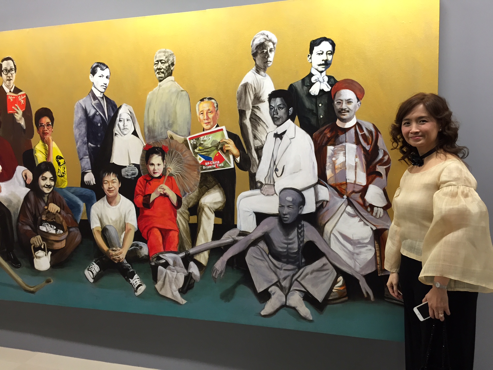
Thankfully, the University of the Philippines—in cooperation with the UP Alumni Association and the Araneta Center Complex—has taken a major step to redressing that shortage, by commissioning 28 of the university’s top alumni artists to produce murals depicting various periods and aspects of Philippine history.

This distinguished roster includes Adonai Artificio, Armand Bacaltos, Adi Baen-Santos, Grandier Bella, Benjie Cabangis, Ben Cabrera, Angel Cacnio, Romeo Carlos, Cris Cruz, Denes Dasco, Gig de Pio, Simkin de Pio, Vincent de Pio, Neil Doloricon, Norman Dreo, Amado Hidalgo, Abdul Asia Mari Imao, Ben Infante, Gigi Javier-Alfonso, Aileen Lanuza, Romeo Mananquil, Norlie Meimban, Julius Samson, Jonahmar Salvosa, Randy Solon, Michael Velasco, Jun Yee, and Janice Young. The resulting exhibit, titled “” or Philippine History in Art—opened at the Araneta Center’s Gateway Gallery last February 18.

The murals—all of a uniform 6’ x 12’ size—cover the full range of Philippine history from pre-Hispanic times to the present, under the guidance of historian Dr. Luisa Camagay and project director and artist Dr. Gigi Javier Alfonso. To UP President Alfredo Pascual, the project is UP’s way of helping to promote a keener historical consciousness among Filipinos, especially the young. The Araneta Center in Cubao, which is marking its 60th anniversary, graciously agreed to host the exhibit in its new 5th-floor gallery.

Coming from a science background, a senior UP official whom I was touring the exhibit with asked me for my critique of the murals on show. I told her that while I was of course pleased with the project as a whole, with its intentions and execution, I personally preferred those works that went a step beyond the literal in their treatment of history, and that dwelt less on the big and obvious historical figures and more on pedestrian realities. I do understand that murals can’t be too abstract, lest they fail to connect with their intended mass audience; in any case, the murals did what they were meant to do, which is to provoke more thought and talk among their viewers.

FullSizeRender

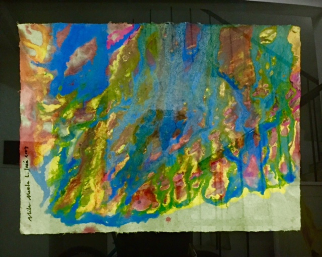
On another front, and also in Quezon City which seems to be shaping up as the cultural center of the metropolis, a new exhibit of paper and paper-based art titled “Pumapapel” opened last week at the Erehwon Center for the Arts, probably the city’s most dynamic privately-operated art center.

This exhibition expands the possibilities of Filipino artistic expression by combining many fields of art making, from painting, drawing, printmaking, mix-media, sculpture and installation, to photography and book/graphic illustration by focusing on the unique qualities of paper as both ground and medium. Curated by UP professor Dr. Reuben R. Cañete, “Pumapapel” features the works of about 100 artists including those of National Artists Vicente Manansala and Benedicto Cabrera, as well as those of Philip Victor, Renato Villanueva, Ofelia Gelvezon-Tequi, Manuel Rodriguez Jr., Juvenal Sanso, and Manuel Ocampo. Also on the list are upcoming artists from the Cordillera, Cebu, Bacolod, and Mindanao, and photographers and graphic artists, among others.

“Pumapapel”’s focus on paper art brings us back, like murals do, to the earliest periods and forms of artistic human expression. From paintings to paper sculpture, this exhibit showcases the myriad possibilities of paper both as medium and material, and also not incidentally celebrates Erehwon’s third year as the upcoming place-to-be for QC-based artists.

Erehwon may not be the easiest place to get to (it’s located at 1 Don Francisco Street, Villa Beatriz Subdivision, Old Balara) but it’s served as a home not only for painters and sculptors but also for musicians, dancers, and writers, thanks to the generosity of its founder and president, Raffy Benitez, and the support of people like Erehwon Arts Foundation President Boysie Villavicencio. (I shouldn’t forget to mention my wife June, who serves as Boysie’s vice president and who has been spending many sleepless nights helping to put this exhibition together.) The Erehwon Center for the Arts’ new Dance Studio was also inaugurated last week.

Pay these exhibits a visit, and you’ll remember and understand how and why art means something to ordinary people, in extraordinary ways.

(Mural by Janice Young. Batik painting on paper by Maela Jose.)


Penman No. 31: The (Ink and) Paper Chase

Oxblood

Penman for Monday, January 28, 2013

ONE THING that fountain pen fanciers rather quickly realize is that their obsession (read: expenses) won’t end at buying another Parker, another Sheaffer, or another Pelikan. You can have bread without butter, or even without coffee on the side; but you can’t write without ink and paper, so that anyone who habitually buys and collects pens soon metamorphoses—even without meaning to—into an ink and paper hoarder as well.

Indeed, inks and papers have become collectibles on their own, and not necessarily together. I have friends who couldn’t care less about pens, but for whom the sheer texture and even the faint aroma of paper can trigger paroxysms of pleasure. These are the people who seek and haunt stationery and art-supply shops, pawing through exotic papers from Thailand, Japan, and Italy, paper that might not even end up being lettered on but pressed into some other service. (And while we’re on this subject, please, please never say “stationary” to refer to writing paper; it’s “stationery” with an E, referring to “stationers”—the people who, in medieval times, sold books in fixed places, as opposed to peddlers who went around with their wares.)

My wife Beng, a watercolor painter and professional art restorer, has one such mecca on 3rd Avenue in New York City, on the second floor of which, up a steep flight of stairs, can be found an astounding array of the world’s finest art papers. But when she visits, Beng’s not looking for paper to paint on; instead, she wants a delicate, silk-like paper made in Thailand that she can use to lay over and stabilize patches of paintings where the paint has begun to flake off.

Forty years ago, when I worked briefly as a printmaker (another of the many hats I’ve worn—and I still wear them now, the real ones!), I too rhapsodized over art paper—the thicker and creamier the better—and on good days or for special jobs, I’d splurge on Strathmore paper, whose texture somehow made any print I designed, however poorly, look rich.

Indeed, it seemed rich of me to get so picky about my papers when, just a few years earlier in my mid-teens, the only paper I knew and cared about was bond paper (the kopong bond we bought at the corner store for 5 centavos a sheet), ruled pad paper for school, and yellow legal pad paper. For special purposes, there was oslo paper and onion skin, and maybe when we got moony we bought some fancy stationery at the bookstore (mine had a picture of the Beatles on every sheet) to write the crush of the moment on (yes, all I’ve ever had in my meager arsenal all my life has been words, words, words).

I still look for good paper these days, but it’s no longer to woo the wenches with (better not, says Beng) nor to pen my next novel on, but simply to test my nibs and inks, like a driver might look for a pristine stretch of track on which to lay some nasty rubber.

And what’s to like and not like about paper? While many kinds of paper—especially the smooth ones—may all look the same from the top, on the microscopic level, they could vary a lot, in terms of the makeup of the fibers and how closely they’re packed together. That means that when the ink flows out of the pen’s nib and gets onto the paper, it will either hold together and more or less stay in one place, or spread out like mad through spaces in the fibers and saturate the paper in such a way that the ink will bleed through, or be visible from, the back side of the sheet.

This latter process is called “feathering” and “bleeding.” You’ll know that your paper feathers when the line you write quickly becomes thicker and fuzzier, sometimes to the point that the letters become hard to read; bleeding or bleed-through, on the other hand, is obvious when you turn the page over and can see the ink. Feathering, I think, is worse than bleed-through; at least you can write on just one side of the paper and still have something crisp and clear, but paper that feathers horribly will leave you with one big blur.

As a general rule, cheap paper—thin, with loose wood-pulp fibers—will feather and bleed. More expensive papers, such as those that use linen, will tend to be thicker and more compact, and therefore offer a more pleasant writing experience. A simple pad or notebook could cost many hundreds of pesos, especially if they sport leather covers and other accoutrements.

In our pen club, the Fountain Pen Network-Philippines, members are forever on the hunt for good but affordable writing paper, even as we may indulge ourselves in the occasional pad of proven performers like Clairefontaine and Rhodia, available in some local bookstores. One sad and surprising discovery that fountain-pen users make early enough is that the iconic Moleskine notebook—whose design I love and have offered whole essays to—isn’t fountain-pen-friendly at all, showing awful feathering and bleeding.

Thankfully, many alternatives to (and copies of) Moleskine now exist, some dearer and others cheaper. A recent experience of mine seems to prove a point. Feeling more expansive than usual on my birthday, I went to the bookstore and spotted a very handsome-looking, leather-bound Jadeco notebook with what appeared to be excellent paper; the tag price of nearly a thousand pesos made me gulp, but what the heck (as I often rationalize these days), at 59 I can excuse anything. I picked it up, paid for it out of my birthday budget, and soon confirmed my expectation that the paper would hold up well to runny fountain-pen ink. The following day, on another sortie to National Book Store, I saw a small spiral notebook (that’s all it says on the kraft-paper cover: “Notebook”) that cost all of P28; on a whim, I bought that, too, and discovered to my chagrin that it performed almost just as well as the Jadeco. I would later learn from friends that some good compromises can be found in the middle of these extremes; I found another one myself a week later, at Fully Booked, under the brand-name Schützen—a regular-sized spiral notebook for P285 that didn’t feather and bled just minimally.

This brings us to inks, which really deserve another column-piece on their own (which I’ll do some other time). Let’s just say for now that inks can even be more bewildering and exhilarating than paper, given the seemingly infinite range of colors and hues you can produce from a mixture of water and pigment. Some inks are also thicker and more saturated than others; some are permanent, and others washable. Some specialty inks, like De Atramentis, can even carry the scents of fruits, flowers, and wines.

I’m not a very adventurous person ink-wise, and for the longest time wrote only with black, blue-black and brown inks; green, bright blue, purple, and red (not to mention yellow and orange) were simply out of character for me. They still are, but I’ve since nudged my range a bit to include Diamine Oxblood (a robust maroon) and Rohrer & Klingner Sepia (a greenish gray reminiscent of old manuscripts) in my small stable. I’m still on the hunt for the perfect blue-black, alternating between the Parker, Pelikan, Montblanc, and Lamy versions. Most days, I just liberally mix things up, turning my desktop into Inkspot City. (Better than alchemy, drop in at Scribe Writing Essentials in Eastwood Mall for a plethora of inks such as J. Herbin, not to mention many fine pens.)

Do take note that the final appearance of your ink will depend not just on chemistry, but on the paper quality, and also on the pen and the nib you use—a wider nib like a stub will deliver a thicker line that shades beautifully as it moves along; that’s what sends pen pushers into seventh heaven.

And what do I write with these exquisite implements? Aside from the occasional signature, absolutely nothing meaningful. I’ve come to realize and to accept that this is how I relax and make myself feel good: by taking hold of a pen worth what someone else more practical might have paid for a fridge or a flat-screen TV, and doing nothing more with it than doodling for hours on premium paper. I liken it to driving around on a lazy weekend to nowhere in particular, just enjoying the scenery and the sweet hum of a perfectly tuned engine. Such are one’s pleasures on the doorstep of one’s dotage.